Healthcare
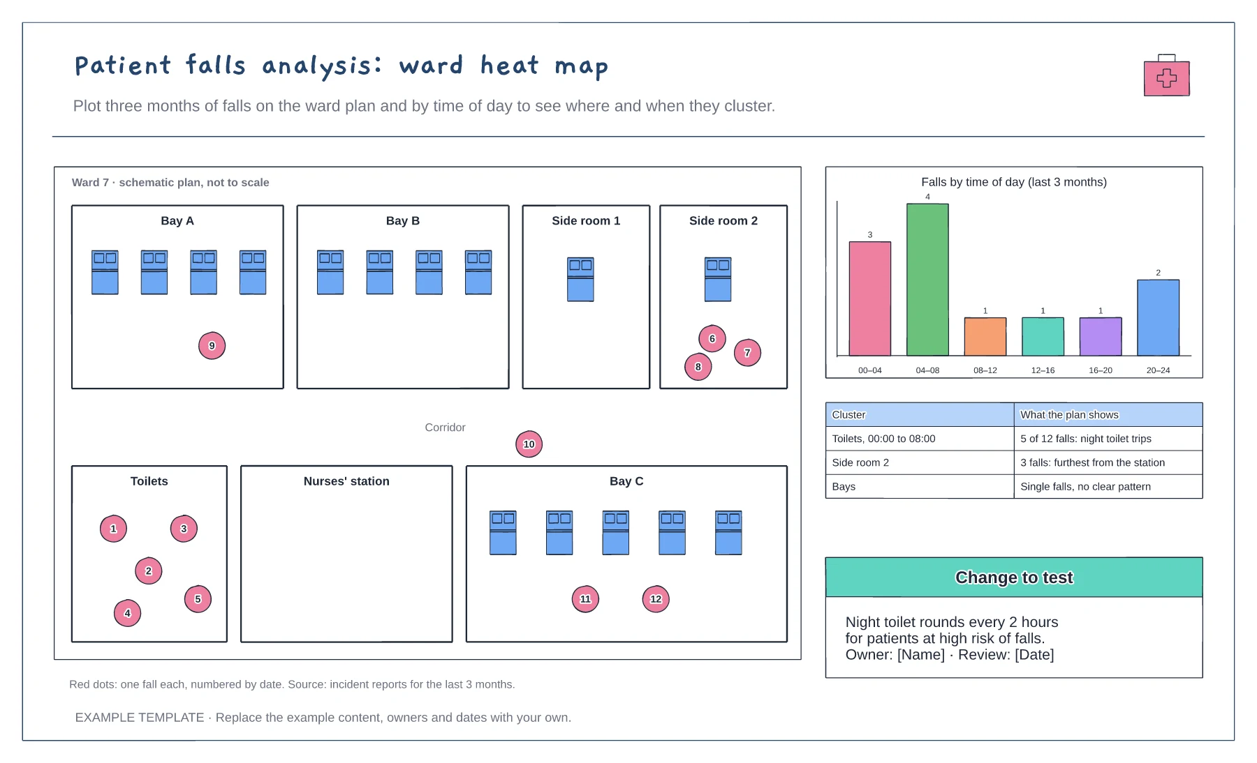
Patient falls analysis: ward heat map template
Ward plan with each fall plotted · Falls by time of day chart · Clusters and a change to test
Preview and use template →Waits in the emergency department build up at predictable times of day. This chart plots arrivals per hour as bars and the number of patients in the department as a line for an example weekday, then marks the pressure points, such as the morning arrival peak and the afternoon point when beds run out, alongside a tally of recorded breach reasons.
This is a planning example for process improvement, not clinical guidance. Follow your organisation's policies and clinical protocols.
No account needed · Opens as your own editable page
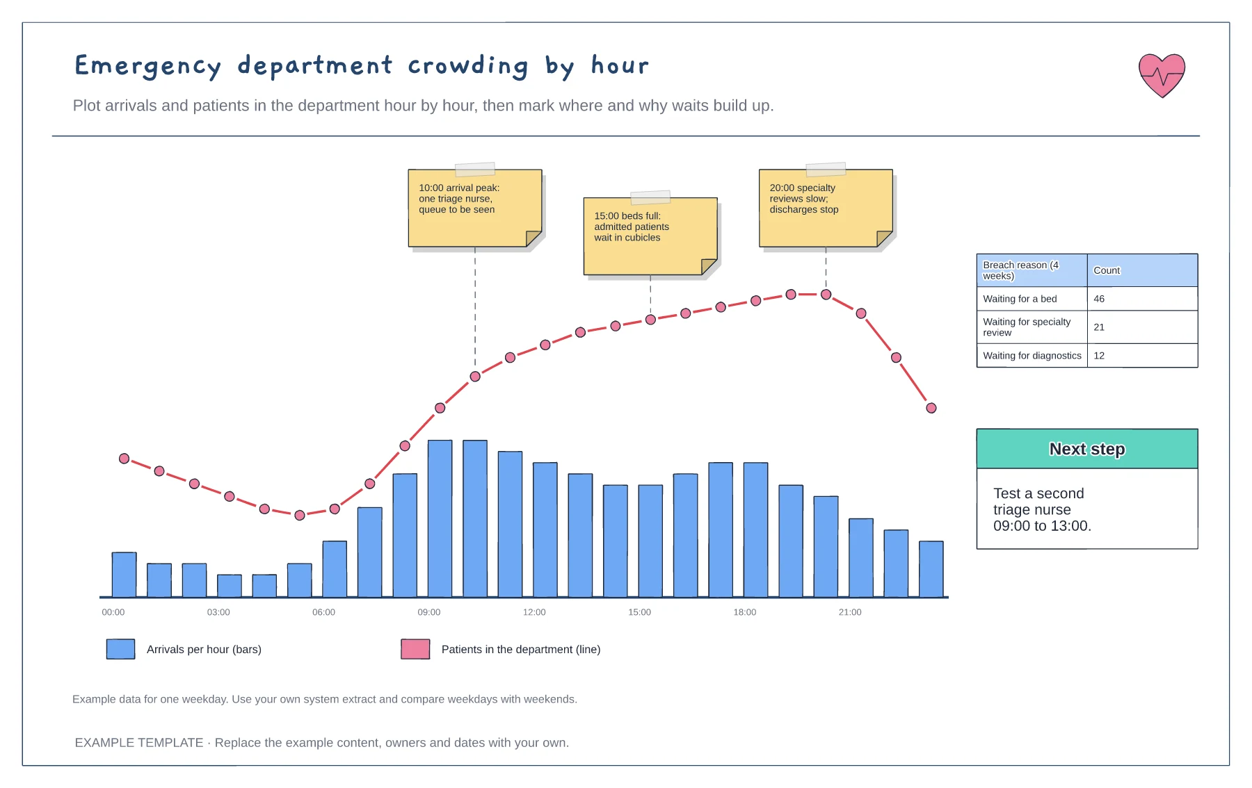
Export arrivals and departures by hour from your system for a typical weekday, and work out how many patients are in the department each hour.
Add a note at each point where the line rises fastest or stays high, saying what is happening then, from staffing to beds.
Pick the earliest pressure point and test one change, such as an extra triage nurse in the morning peak, then redraw the chart.
Edit the bar labels and heights for each hour, then redraw the occupancy line to match. Keep the pressure point notes beside the hours where they happened.
No. Open the template and edit it in your browser. Your work saves on this device. An account is optional if you want to sync your workspace.
Yes. Use Export in the editor to save a PNG, SVG or PDF, or download an editable .epicdraw backup.
Ward plan with each fall plotted · Falls by time of day chart · Clusters and a change to test
Preview and use template →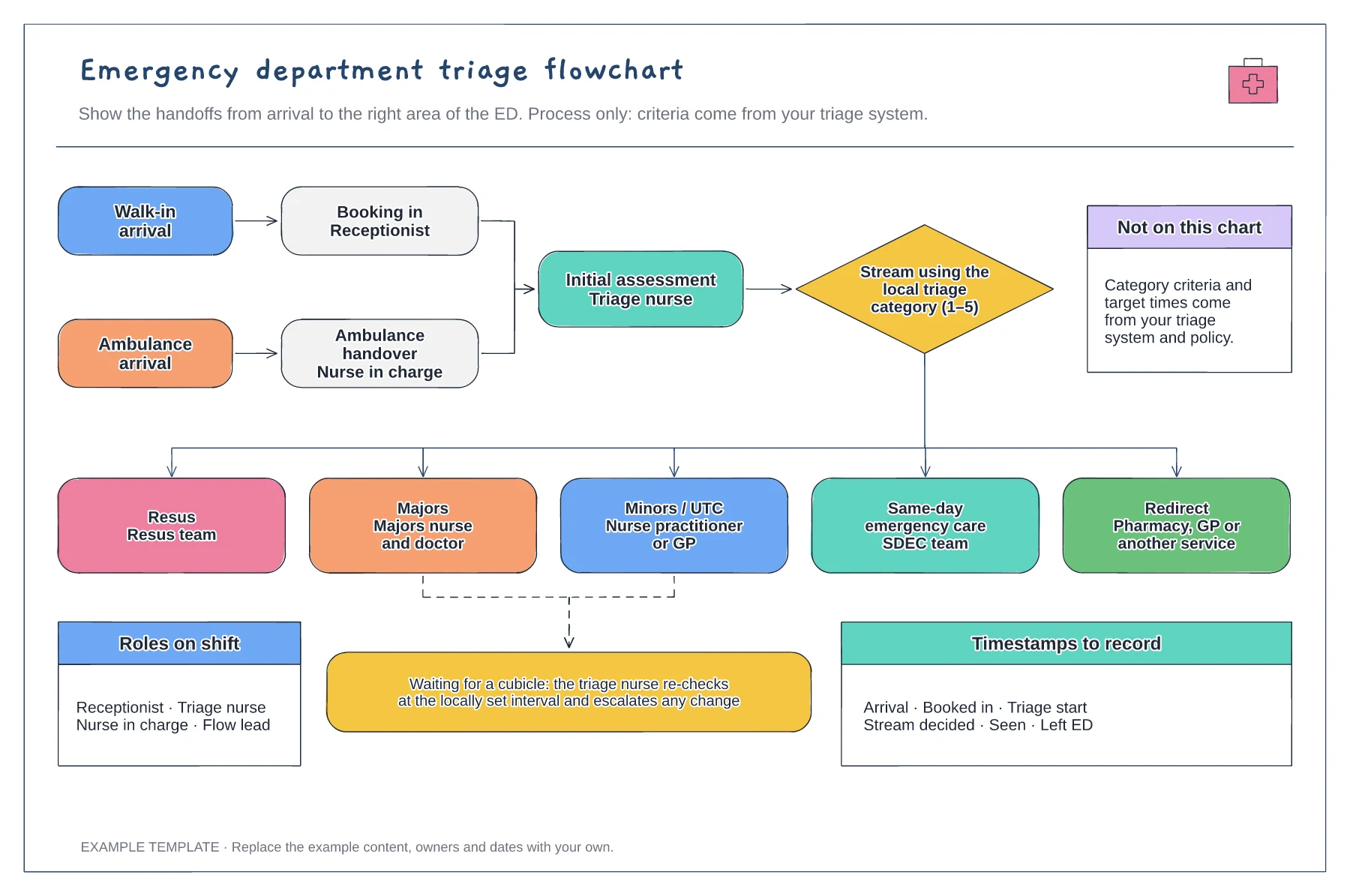
Walk-in and ambulance arrival routes · Streaming to five areas of the ED · Waiting re-check loop and timestamps
Preview and use template →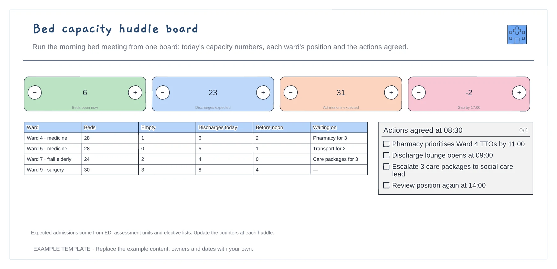
Four headline capacity counts · Ward-by-ward position · Actions agreed at the huddle
Preview and use template →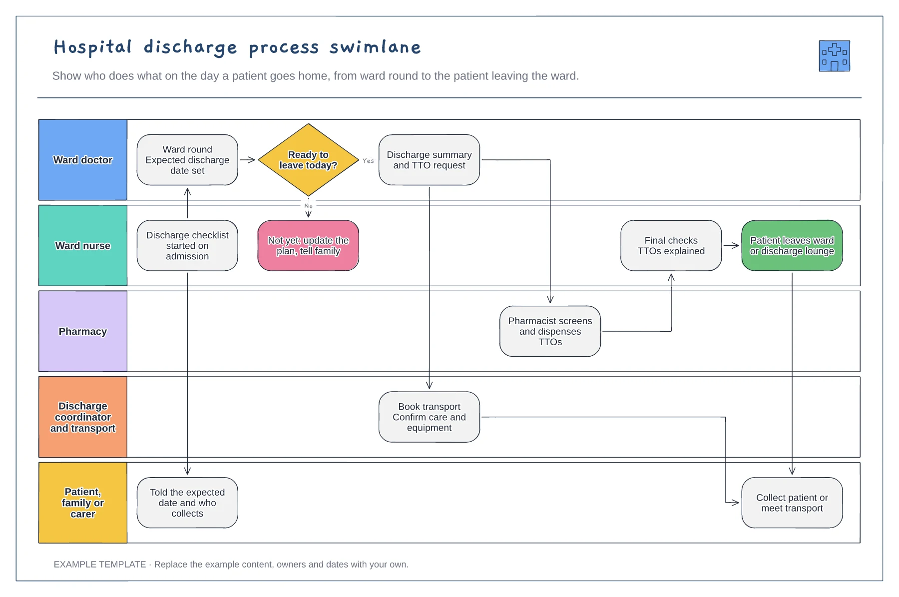
Five lanes from ward doctor to family · Ready-to-leave decision with a not-yet path · TTO, transport and final-check handovers
Preview and use template →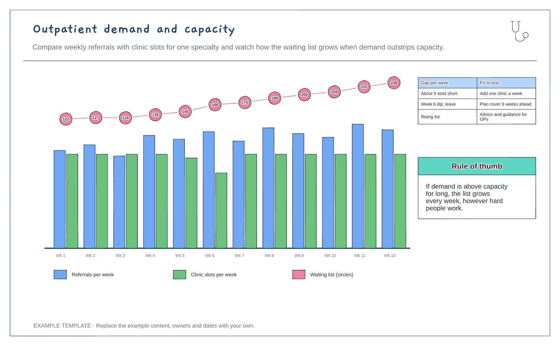
Weekly referrals and clinic slots · Waiting list growth · Gap and fixes to test
Preview and use template →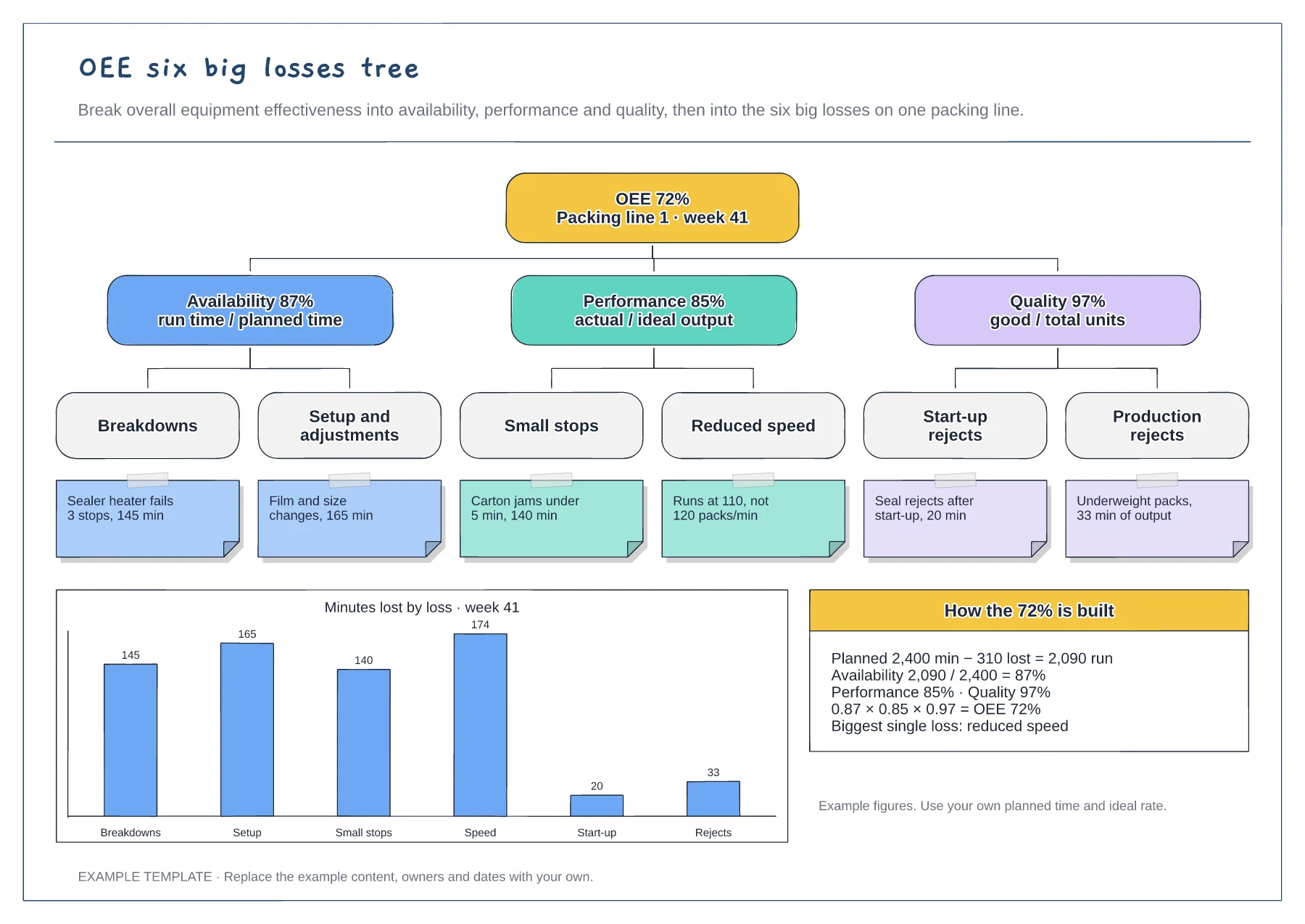
Tree from OEE to the six big losses · Example cause under each loss · Minutes-lost chart and the OEE calculation
Preview and use template →