Healthcare
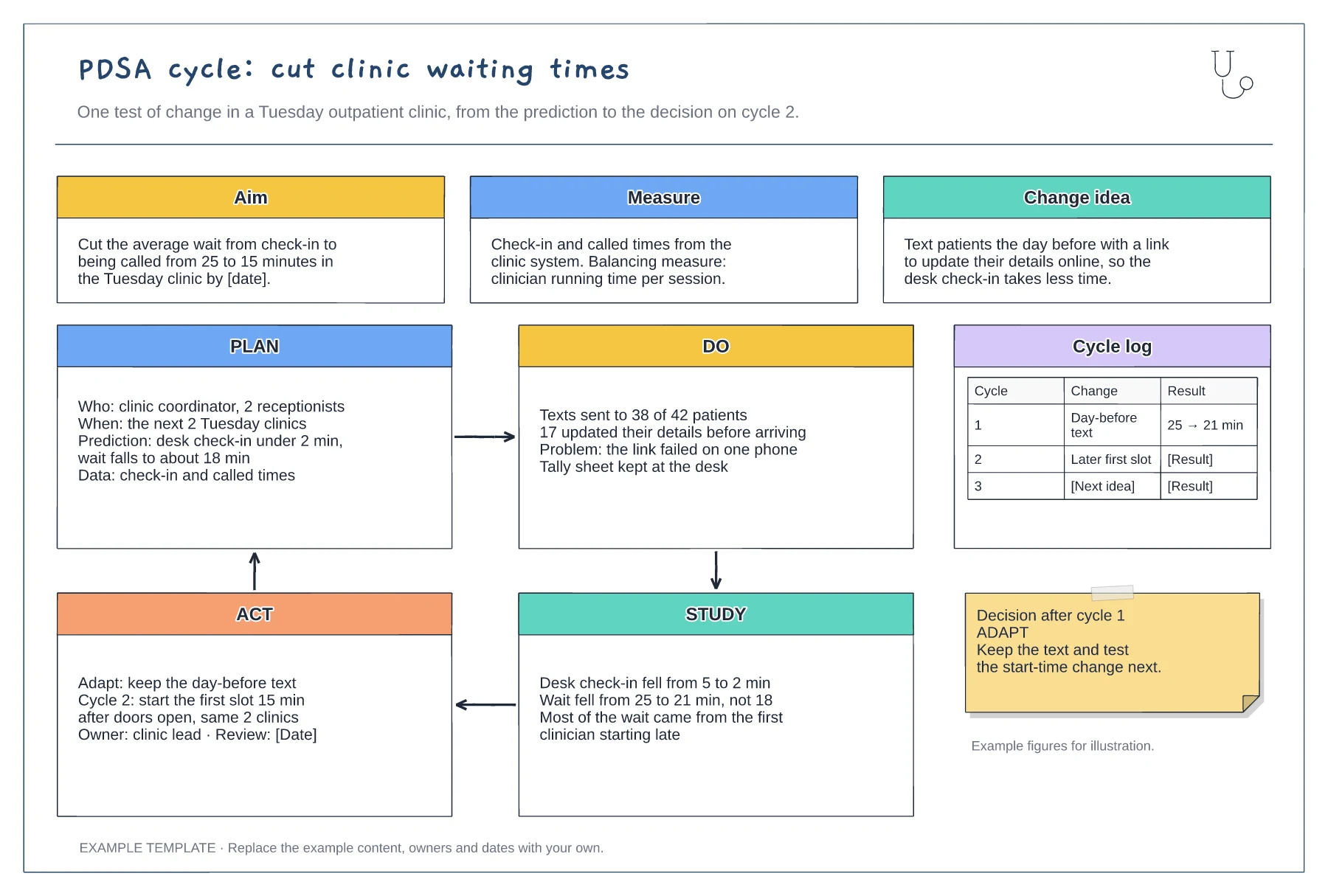
PDSA cycle example: clinic waiting times template
Aim, measure and change idea · Filled-in Plan, Do, Study and Act panels · Cycle log and decision note
Preview and use template →A run chart shows whether a change is making a difference over time, rather than relying on one good week. This example plots the number of patients medically fit for discharge but still in hospital each week for twenty weeks, marks three tests of change, shows the median before and after, and lists the main reasons for delay.
This is a planning example for process improvement, not clinical guidance. Follow your organisation's policies and clinical protocols.
No account needed · Opens as your own editable page
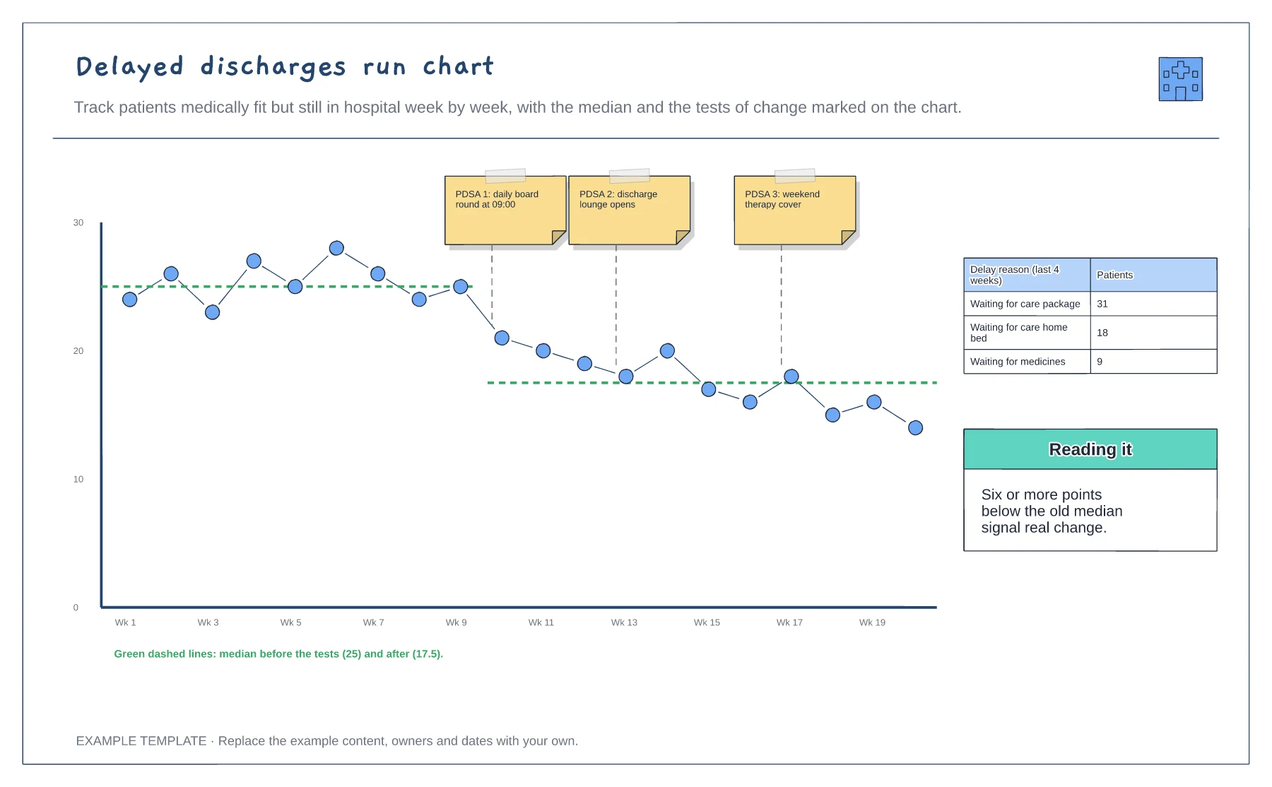
Define exactly what counts, such as patients medically fit for discharge at midnight, and collect it the same way every week.
Plot at least 10 to 12 points before you change anything and draw the median line.
Annotate each test of change on the date it started. Look for runs of points below the old median.
Add a labelled marker on the week the change started, then draw a new median line from that point so the before and after periods can be compared.
No. Open the template and edit it in your browser. Your work saves on this device. An account is optional if you want to sync your workspace.
Yes. Use Export in the editor to save a PNG, SVG or PDF, or download an editable .epicdraw backup.
Aim, measure and change idea · Filled-in Plan, Do, Study and Act panels · Cycle log and decision note
Preview and use template →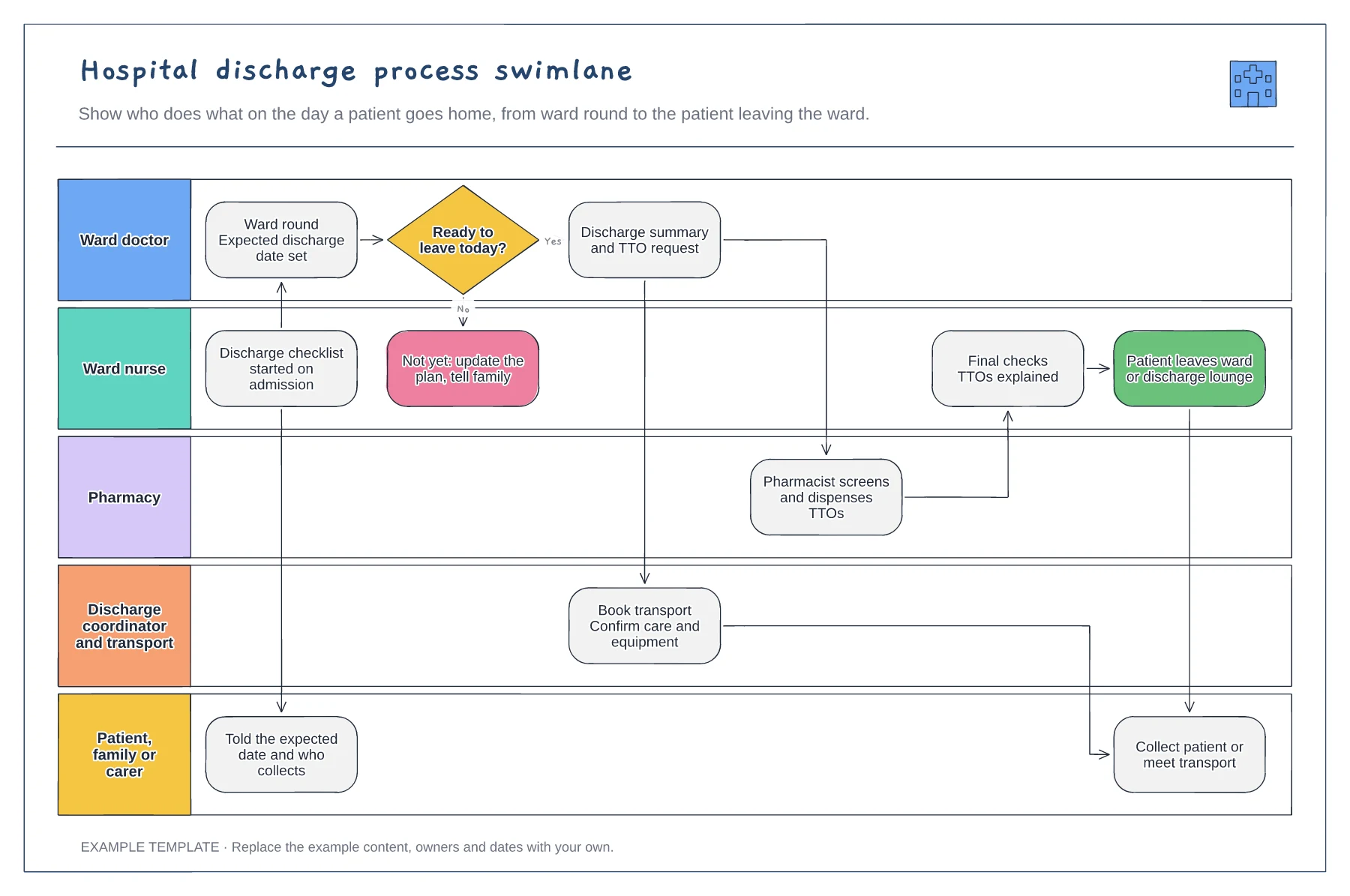
Five lanes from ward doctor to family · Ready-to-leave decision with a not-yet path · TTO, transport and final-check handovers
Preview and use template →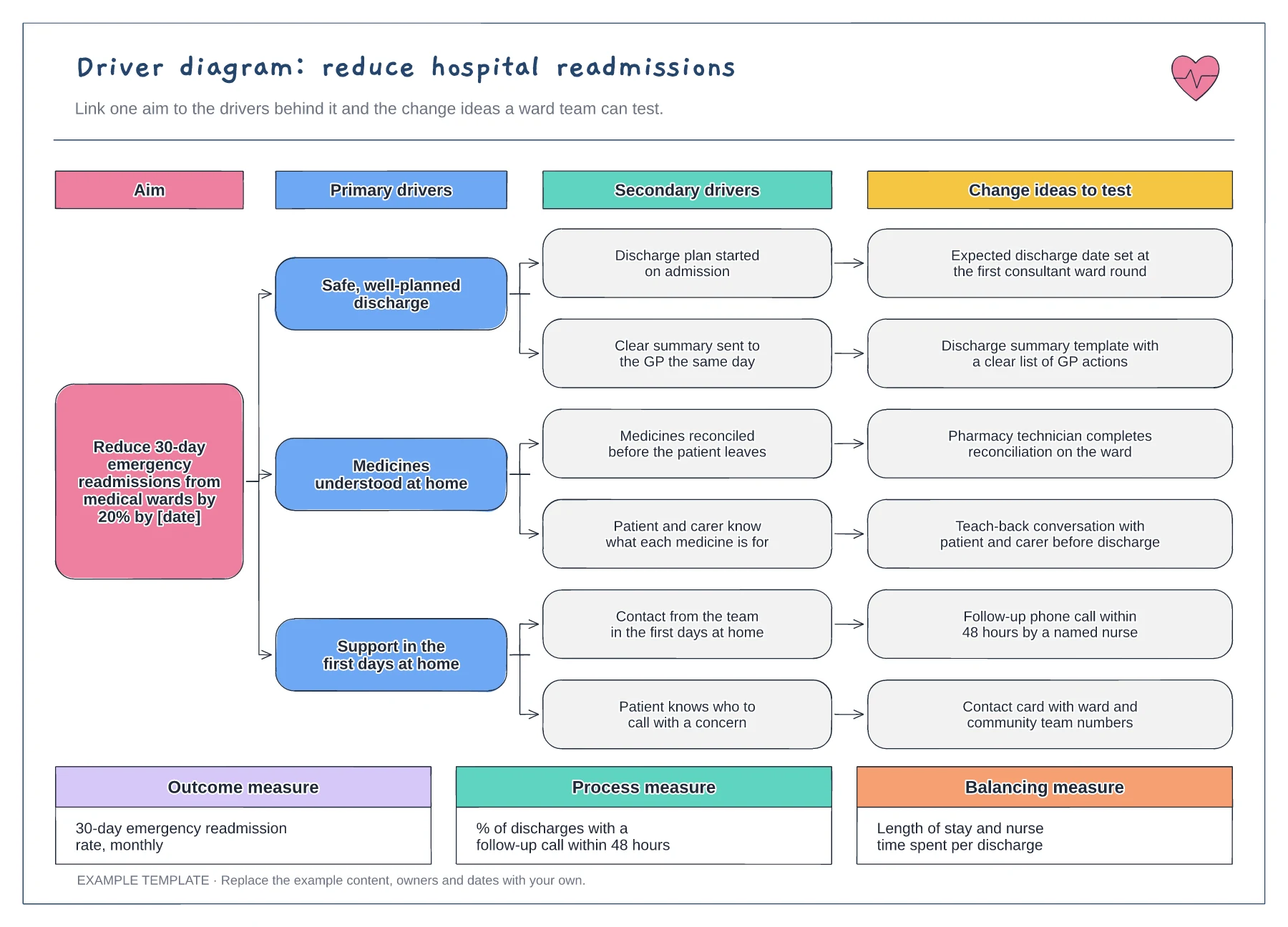
Aim with a target and date · Primary and secondary drivers · Change ideas and three types of measure
Preview and use template →
Problem statement and current condition · Cause analysis and countermeasure plan · Owners, checks and follow-up
Preview and use template →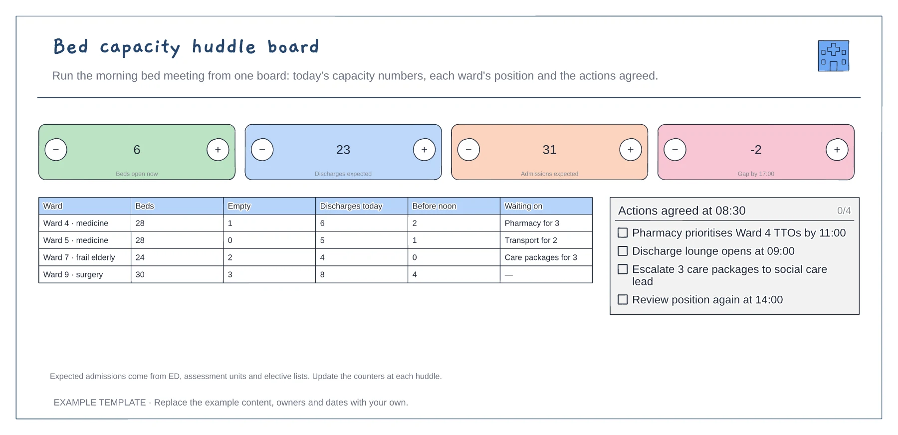
Four headline capacity counts · Ward-by-ward position · Actions agreed at the huddle
Preview and use template →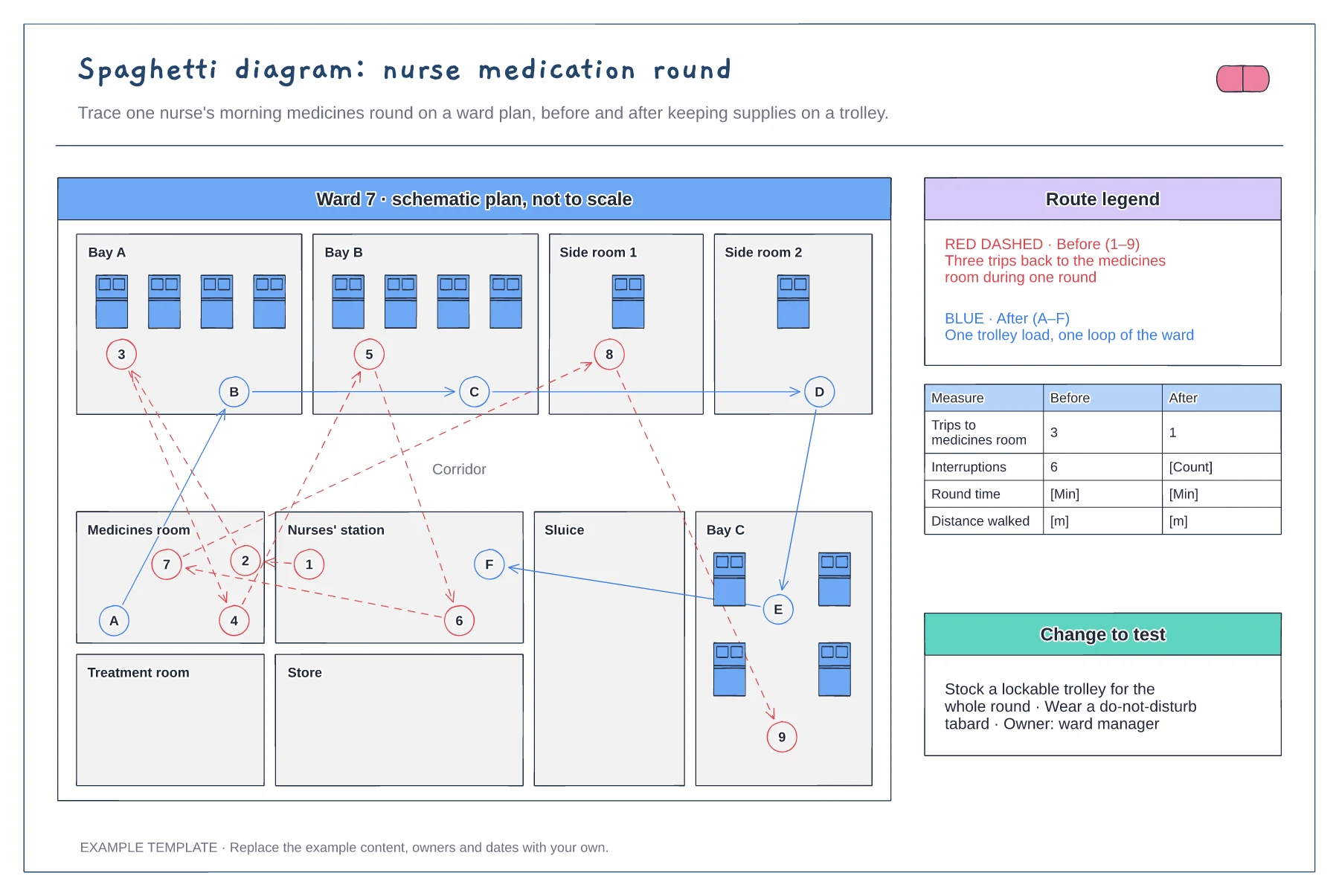
Ward floor plan with bays and rooms · Before and after routes with numbered stops · Measures table and change to test
Preview and use template →