A product decision is easier to make when the people in the room can see the question, the evidence and the options on one page. A deck that opens with your recommendation asks them to trust you or to argue with you. A visual evidence pack gives them something to check instead.
This guide shows you how to present a product decision with visual evidence: write the decision as a question, show what each piece of evidence can and can't tell you, lay out the options beside a baseline, recommend one and record the outcome. You can then walk through the finished pack in EpicDraw's Present mode.
What a visual evidence pack has to show
Each part answers something the approver would otherwise have to ask:
| Part | Question it answers |
|---|---|
| Decision needed | What am I being asked to choose, and by when? |
| Evidence | What do we know, and how far can we trust it? |
| Options | What could we do, including nothing? |
| Recommendation | What do you propose, and what would we give up? |
| Decision record | What did we decide, and what happens next? |
Each part depends on the one before: evidence only means something against a question, and a recommendation is a choice between options. The editable starter on this page works as a product decision presentation template, with those links already drawn in.
State the decision needed
To keep this concrete, the guide follows one fictional example: a site that sells weekend workshops, where the team wants to redesign booking. You're the product lead, and your job is to get a funding decision at Thursday's review. The person booking has a different job: they want a seat at a price they understand. Your pack settles the first, and its evidence comes from the second. All the numbers below are invented.
"Booking redesign update" is a topic, and a topic gives nobody anything to decide. Write a question that ends in a choice:
Which booking change should we fund next?
Choose A, B or C at Thursday's product review.
Then name who answers it. Atlassian's DACI play describes the Approver as the one person who makes the decision, with contributors advising and others informed of the result. Putting that name at the top stops a review ending in general agreement that nobody owns.
Add the goal too, because it's what you'll judge the options against. Here it's "more people finish booking, with no rise in support emails".
Show evidence with its limits
Put each piece of evidence on its own card, with one line for what it shows and one for what it can't show.
| Evidence | What it shows | Its limit |
|---|---|---|
| Analytics | 42 of 100 people who start booking finish, and most who leave do so at step 2 | Shows where people leave, not why |
| Support inbox | 18 of 60 booking emails ask for the total price | Only counts people who wrote in |
| Interviews | 4 of 6 people said three steps felt long for one seat | A small sample, and what they said rather than did |
| Estimates | B takes 3 days, C takes 4 weeks | Rough, and C assumes a payment check passes |
The limit line protects you in the meeting. If someone asks whether six interviews are enough, the answer is already on the page, and you can talk about what the evidence does support. The UK Treasury's Green Book, written for government appraisal, makes the same point more formally: practitioners should state their assumptions so they're transparent and agreed by decision makers.
Keep anything you don't know visible. In the example, nobody has confirmed whether the payment provider allows card entry on a single page. That goes on its own sand card with an owner.
Compare the options against a baseline
Sketch each option small enough to compare at a glance, and start with what happens if you change nothing. The Green Book calls this business as usual and treats it as the benchmark for other proposals. The useful question for a product team is the same: is this better than leaving things alone?
The same guidance suggests including a do-minimum option, the one that just meets the objectives, because it shows whether a bigger option adds anything worthwhile. That gives the example three choices:
- A keeps three steps. There's no build, and the drop-off stays.
- B shows the total on step 1. It takes 3 days and answers the price question.
- C puts everything on one page. It takes 4 weeks and has the fewest steps.
Atlassian suggests a table for this, with each option's description, pros and cons, and estimated cost. A sketch adds what a table can't: people can see that B and A are the same route and C is a different one. If you're still choosing between arrangements, compare the layouts against shared requirements first.
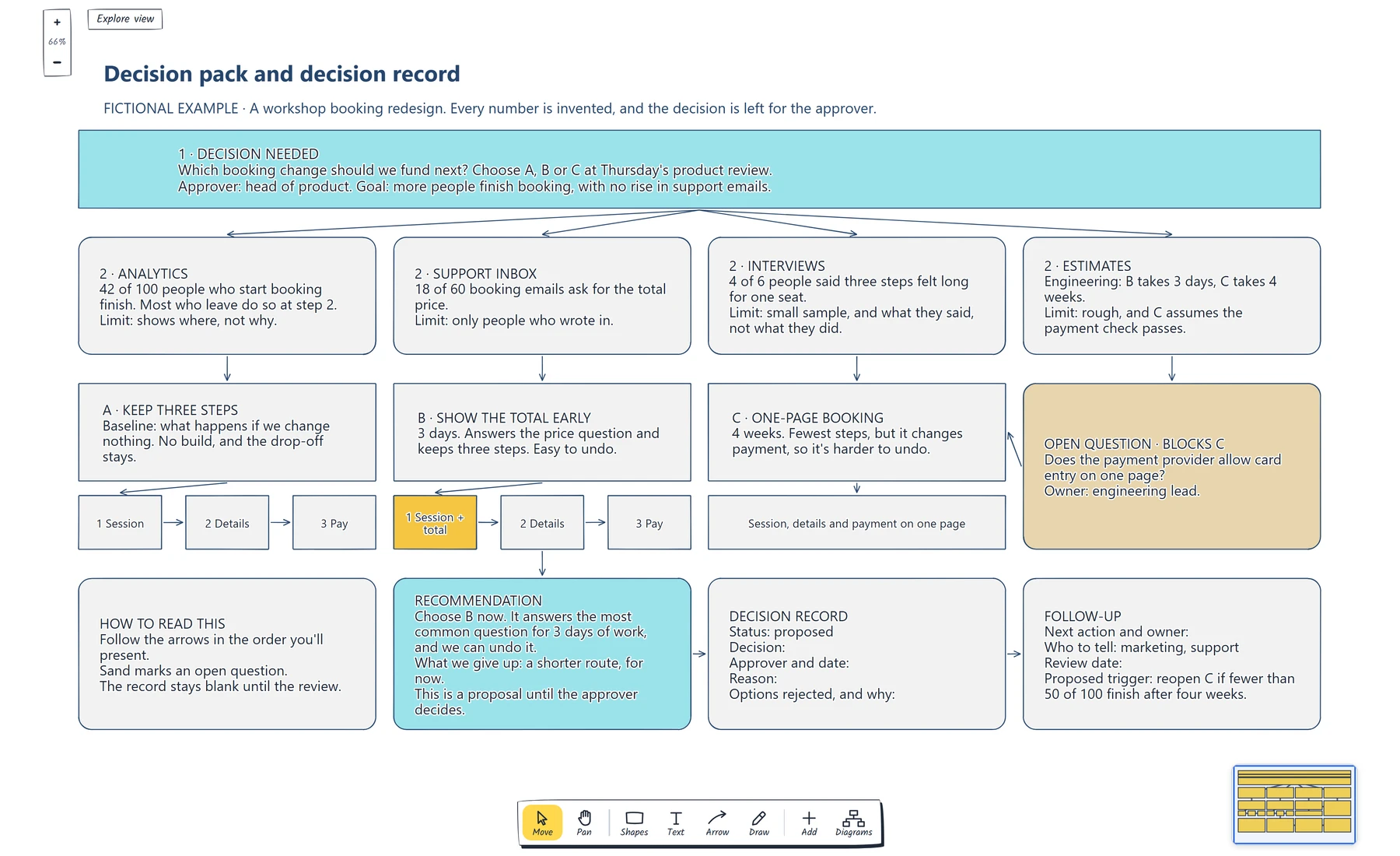
Read it top to bottom. The evidence leads to the options, the sand card shows what blocks option C, and the record stays blank until the approver has decided.
If you have more candidates than one pack can hold, build a feature prioritisation board to narrow them down first.
Recommend, and say how hard it is to undo
The pack still needs your view. Say which option you propose and what you'd give up. Here, that's B: it answers the most common question for 3 days of work, and the cost is a route that stays three steps long for now.
Reversibility helps you judge how much certainty to ask for. In Amazon's 2015 letter to shareholders, Jeff Bezos separates consequential decisions that are nearly irreversible, one-way doors, from changeable ones that can be made quickly and revisited. B is close to the second kind, since you can remove a price line. C changes how payment works, so it's harder to back out of and deserves more evidence first.
Label the recommendation as a proposal, because the approver may disagree.
Present the pack in EpicDraw
Open the editable starter near the top of this page. It adds a new page to your workspace and leaves your other pages alone. Double-click a label to replace the prompts with your own question, evidence and options.
Send a pre-read so people arrive having seen the evidence. Press Share and choose Review and comment, which lets reviewers comment on shapes without changing the drawing. Creating the link needs a free account, though reviewers don't need one. To attach a file instead, open More, choose Export and download a PDF.
In the meeting, open More and choose Present. Present mode reveals the page one step at a time, and the order comes from your arrows: shapes with nothing pointing at them appear first, then whatever they point to. The example runs through eight steps, from the question to the follow-up, so nobody reads the recommendation before they've seen the evidence. Unconnected shapes stay on screen throughout, so connect anything you don't want shown early. After the last step, Full map zooms out so the room can discuss the whole page.
Record the decision and follow-up
Fill in the record while everyone's still there, because someone will ask why this was chosen long after the meeting.
Michael Nygard's note on documenting architecture decisions explains the risk: without the reasoning, people who join later can only accept a decision blindly or reverse it blindly. His format works outside software too: a status such as proposed or accepted, the decision, and all its consequences. When a decision changes, keep the old record and mark it superseded.
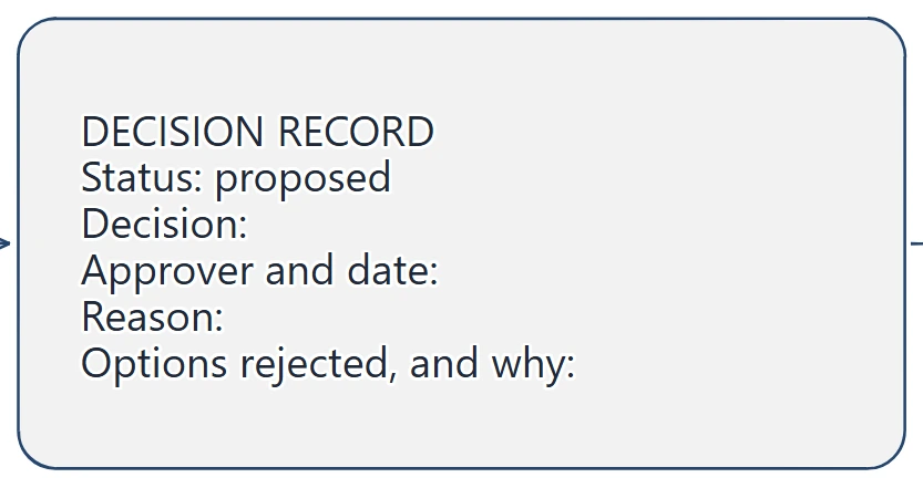
The status says proposed until the approver decides. Note the line for rejected options: it stops someone reopening the same debate without new evidence.
Then add the follow-up: the next action and its owner, who needs telling, a review date, and what would reopen the decision. In the example, the proposed trigger is fewer than 50 of 100 people finishing booking after four weeks. The Green Book's switching values follow a similar idea, asking how far a key assumption would have to move before you'd choose differently.
If the follow-up involves several people, a RACI chart can show who does the work and who signs it off. If option C returns, write an experiment plan before anyone builds it.
Review checklist
Copy this into your notes before the meeting:
Decision needed, as a question with a choice:
Approver and decision date:
Goal the options are judged against:

Evidence, what it shows and its limit:
Open questions and their owners:

Baseline, if we change nothing:
Options, with cost and how easy each is to undo:
Recommendation and what we give up:

Decision, approver, date and reason:
Options rejected, and why:
Next action, owner and who to tell:
Review date and what would reopen this:
If you can't fill in the first line, you're not ready to ask for a decision. Share the evidence as an update and say what you still need to find out.
Optional: create the example with an AI assistant
If you use an AI assistant that supports remote MCP with OAuth sign-in, it can build this pack in your EpicDraw workspace. MCP is the connection that lets the assistant use EpicDraw's diagram tools.
This route needs a free EpicDraw account and cloud sync, and only synced pages are available remotely. Open More, choose Connect AI assistant and add https://epicdraw.app/mcp in your assistant. When EpicDraw asks you to approve the connection, tick the option to allow it to create and edit diagrams, because a read-only connection can't create this page. The MCP connection guide walks through each step.
Paste this prompt into the connected assistant:
Using the connected EpicDraw MCP server, create a new editable page named "Decision pack and decision record". Leave existing pages unchanged.

Create a visual decision pack for a fictional workshop booking redesign. At the top, ask "Which booking change should we fund next?" and name the head of product as approver. Add four evidence cards for analytics, support inbox, interviews and estimates, each with an invented number marked as fictional and a line saying what it can't show. Connect them to three options with small layout sketches: A keeps three steps as the baseline, B shows the total early, and C is one-page booking. Add an open question about whether the payment provider allows card entry on one page. Then add a recommendation for B labelled as a proposal, a decision record with the decision left blank and status proposed, and a follow-up card with a proposed trigger for reopening C.

Use editable shapes, text and connectors. Label the example as fictional and mark unknowns as open questions. This is a visual planning draft. Check for overlapping objects and overflowing labels, then return a PNG preview and the private editor link. Leave the result as a draft for me to review.
Open the returned private editor link while signed in. The layout will vary and may differ from the screenshot, so review the labels, the assumptions and the arrows, and check that the decision is still blank. Replace every invented number with your own evidence before you show it to anyone. The result is a planning draft: an assistant can lay out a pack, but it can't supply your evidence or make the decision.
Takeaways
- Write the decision as a question with a choice, and name the one person who'll answer it.
- Give every piece of evidence a limit, and keep open questions visible with an owner.
- Compare options with a baseline, including the smallest change that meets the goal.
- Say how hard each option is to undo, because that sets how much certainty you need.
- Use arrows to set the order in Present mode, so the evidence comes before the recommendation.
- Record the decision, the rejected options and what would reopen it before the meeting ends.
Keep your next draft close
Create a free account to save your pages in the cloud and use them across devices.
Create a free accountYou can keep drawing without an account.