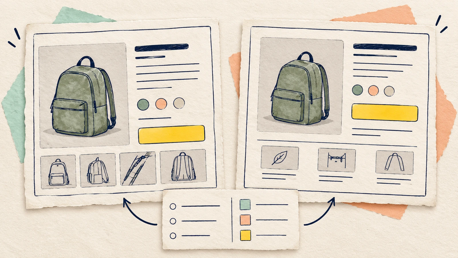
To compare two wireframe layouts, give both the same user task, content and review criteria. Change the arrangement, then record where each layout supports the task and what still needs evidence. A useful comparison should tell your team what to keep, change or investigate next.
For a product designer, the job is to make the choice explainable. This guide compares two product pages, shows how to separate a visible difference from an assumption about its effect, and provides an editable comparison board.
Agree requirements before arranging the page
Start with what the person using the page needs to do. Turn that task into questions the design must answer. "Looks cleaner" describes a preference; "the shopper can identify the selected size before adding it" gives you something concrete to inspect.
Agree which requirements are essential and which choices are flexible. A different layout must still include the information needed for the task. If one version drops a difficult delivery question, it is offering a different content scope rather than solving the same layout problem.
Keep the sketches at a similar level of detail. Figma's low-fidelity prototyping guide describes wireframes as simple representations of layout and content hierarchy. Use meaningful labels in both, with enough roughness to move them easily.
Set up one buying task and a shared content list
Our example uses a fictional Everyday backpack. The £49 price, Navy and Olive colours, and 18L and 24L options are illustrative. Fit measurements, stock, delivery and returns remain unconfirmed.
The shopper wants to choose a commuting backpack for a 13-inch laptop and understand the cost before adding it. The review question is: "Which layout makes the buying information easier to find?"
Use the same requirements in both versions:
| Requirement | What to inspect | Shared content or gap |
|---|---|---|
| Judge laptop fit | Can the shopper find the information needed to check their laptop? | Photo brief and internal measurements to confirm |
| Know the chosen version | Are selected colour, capacity and availability clear? | Navy / 18L selected; stock unknown |
| Understand the cost | Where do price and delivery information appear relative to the action? | £49 per bag; delivery charge, arrival and conditions to confirm |
| Check returns | Is there a clear summary or policy destination? | Returns information to confirm |
A capacity label does not supply an internal measurement. Keep that gap visible in both layouts so a tidier arrangement cannot hide an unanswered buying question.
Baymard's product-page research recommends an order-cost estimate near the buying section and a returns summary or policy link in the main content. These give you concrete placement questions; they do not select a winner for this example.
If you are still deciding which buying information belongs on the page, use the product page wireframe guide to choose the content before comparing its placement.
Sketch two distinct arrangements
Open the editable starter near the top of this guide. It adds a new page while preserving existing drawings. You can also download the worked example and open it with Import in EpicDraw. Double-click a label to replace the task or product content.
The board puts A and B side by side:
- A places the photo beside the price, options and basket action. Fit information sits below the photo; delivery and returns sit below the action.
- B puts a wide photo before the fit information, options and basket action. Delivery and returns sit alongside that lower buying area.
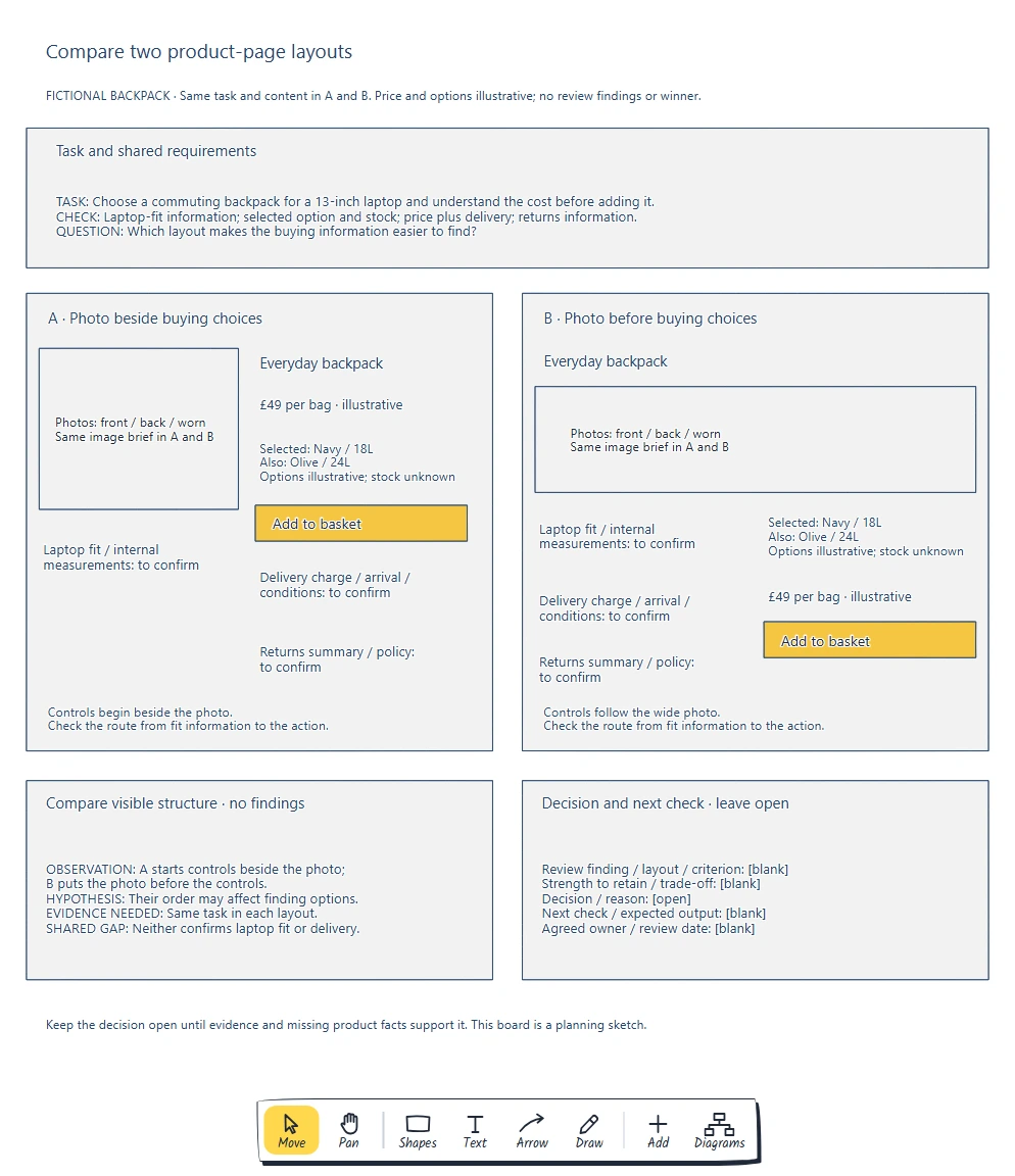
Both sketches contain the same buying information and unresolved facts. The comparison changes its arrangement, while the decision record remains open.
Replace each product fact in both versions. Keep the wording, selected option, photo brief and action label consistent. Otherwise, a reviewer may prefer clearer copy in one version and attribute that difference to the layout.
Move the shapes to explore a different grouping or order. Keep the page width comparable and use the same intended screen size. Review a mobile version separately at a shared narrow width; a wide desktop drawing cannot establish whether its stacked version works.
Compare each requirement in both layouts
Give a colleague the buying task before explaining either arrangement. Ask them to point to the information they would use, describe the selected version and explain what happens when they choose Add to basket.
Record the screen area and the reason behind each comment. "A's options start beside the photo" is visible in the drawing. "A will make choosing faster" is a hypothesis that needs evidence.
This example suggests two useful checks:
| Visible difference or shared gap | Question to investigate |
|---|---|
| A starts its buying controls beside the photo; B puts a wide photo first | How does each arrangement affect finding the selected option? |
| Both leave laptop measurements and delivery terms unconfirmed | Which product facts must be supplied before either design answers the buying task? |
Use the same questions for both versions. Note useful choices to retain as well as concerns. For instance, a reviewer might value B's space for showing the backpack, while questioning how far the options sit from the page title. Capture their reasoning before proposing a change.
A colleague walkthrough helps expose gaps and competing interpretations. When the decision depends on how intended shoppers find or understand information, use suitable prototypes and research with those shoppers. Keep the test task and content comparable, and plan how to handle the order in which people encounter the designs.
Record a trade-off and the next check
Now return to the requirements. Separate missing information from arrangement problems. Both versions need verified laptop-fit information; moving that placeholder does not answer whether the laptop fits.
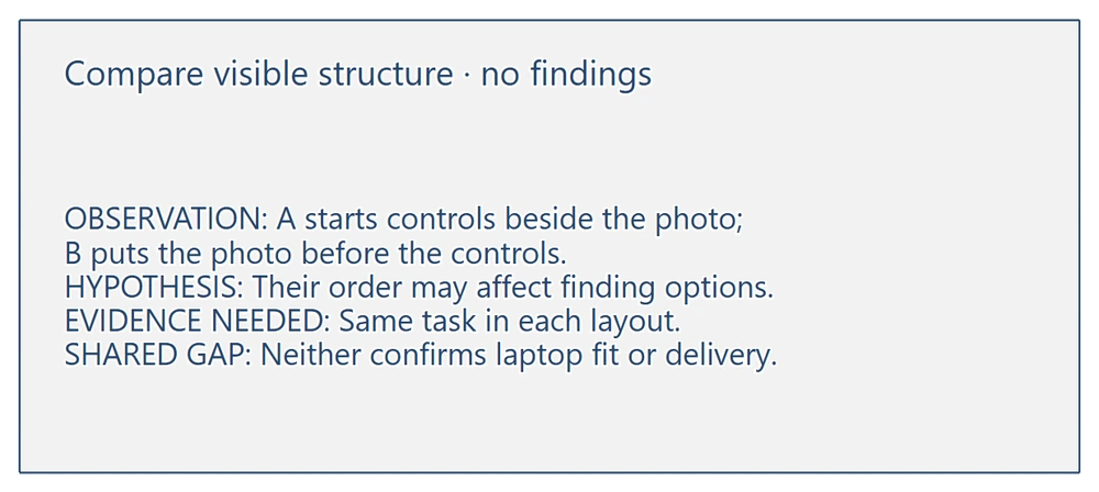
The card describes what differs without turning it into a user finding. Its shared-gap note keeps missing product facts in the decision.
Avoid a total score that makes an essential failure look acceptable because the layout earned points elsewhere. If you use ratings, define them together, keep the underlying observations and show unmet essential requirements separately.
Compare wireframe layouts with this template to keep the decision traceable:
Task / screen size / versions:
Requirement:
A: visible evidence / review observation:
B: visible evidence / review observation:
Shared missing fact:
Strength to retain / trade-off:
Hypothesis / evidence still needed:
Decision / reason, or why it stays open:
Next check and expected output:
Agreed owner / review date:
Leave the example's decision open. A useful next step might be obtaining internal measurements or checking how shoppers find the selected option in each arrangement. Agree an owner and a review point for the actual work.
You can also combine useful parts of both sketches. Treat that combination as another design to review against the requirements. Record what changed and why so the next reviewer can follow the reasoning.
Review checklist
Before you compare wireframe layouts, use this checklist:
- Do both versions support the same task, content and screen size?
- Are the essential requirements agreed before the review?
- Is each comment tied to a specific area and requirement?
- Are visible differences separate from claims about user behaviour?
- Are missing product facts visible in both versions?
- Have you recorded strengths, trade-offs and evidence still needed?
- Does the next action have an agreed owner and review point?
Optional: create the comparison with an AI assistant
MCP connects a compatible AI assistant to EpicDraw's diagram tools. Use a free EpicDraw account, enable cloud sync and choose an assistant that supports remote MCP with OAuth sign-in.
Open More, choose Connect AI assistant and add https://epicdraw.app/mcp in your assistant. Approve permission to create and edit diagrams. The MCP connection guide explains the setup.
Paste this prompt into the connected assistant:
Using the connected EpicDraw MCP server, create a new editable page named "Side-by-side comparison and decision board". Leave existing pages unchanged.

Create two product-page wireframes for a fictional Everyday backpack. Use identical content: photos showing front/back/worn views; laptop fit/internal measurements to confirm; £49 per bag marked illustrative; selected Navy/18L with Olive/24L alternatives marked illustrative and stock unknown; delivery charge/arrival/conditions to confirm; returns summary/policy to confirm; and Add to basket. In A, put a photo beside the price, options and action, with fit information below the photo and delivery/returns below the action. In B, put a wide photo before fit information, options and the action, keeping delivery and returns nearby. Give both the task "Choose a commuting backpack for a 13-inch laptop and understand the cost before adding it" and criteria for fit, selected option/stock, price/delivery and returns. Add the question "Which layout makes the buying information easier to find?". Label the visible observation that A starts controls beside the photo and B puts the photo before controls. Mark any ease-of-finding claim as a hypothesis needing the same task in each layout. State that neither confirms laptop fit or delivery. Leave review findings, strengths/trade-offs, decision/reason, next check/output, agreed owner and review date blank or open.

Use editable shapes and text. Label the example as fictional and mark unknowns as open questions. This is a visual planning draft. Check for overlapping objects and overflowing labels, then return a PNG preview and the private editor link. Leave the result as a draft for me to review.
Inspect the PNG and open the private editor link while signed in. Layouts vary, so check that the content matches across both versions and the decision remains open. The assistant creates a planning board; it does not verify product facts, conduct shopper research or build a working store.
Takeaways
- Agree the task and requirements before comparing arrangements.
- Keep content consistent so you can discuss what the placement changes.
- Separate a visible difference from an assumption about its effect.
- Give shared information gaps an investigation instead of hiding them in a score.
- Record the evidence, trade-off and next action behind the decision.
Keep your next draft close
Create a free account to save your pages in the cloud and use them across devices.
Create a free accountYou can keep drawing without an account.