
Use a user flow to discuss steps and decisions, a wireframe to discuss the content and layout of a screen, and a wireflow to discuss what changes after an action. Start with the question your team needs to answer, then choose the drawing that makes that question visible.
For designers and product managers, the useful outcome is a decision the team can review. This guide compares the formats using the same booking task. The editable comparison board lets you inspect the differences, and the worksheet helps you choose one for your own review.
What each format helps you discuss
The formats overlap, especially when you add annotations. These are useful starting points for choosing the main focus:
| Format | Main focus | A useful review question | What to add if it is missing |
|---|---|---|---|
| User flow | Actions, decisions and alternative routes | Which steps lead to the intended endpoint? | Screen content when the route depends on what someone sees |
| Wireframe | Information, controls and their placement | Does this screen give someone what they need to act? | Another state when the action changes the screen |
| Wireflow | Screen layouts connected by actions or outcomes | What does the person see after this action, and how can they continue? | Undrawn branches or product rules needed for that review |
Figma describes a user flow as the steps someone takes to complete a task, including decisions and an endpoint. Its wireframing guide describes screen layouts and interface elements. Nielsen Norman Group defines wireflows as a combination of rough screen layouts and flow connections.
A wireflow can show two states of the same page. A wireframe can carry notes about behaviour. Agree the scope and the review question with your team, because the format name alone will not explain what the drawing covers.
Keep the task the same while comparing
Our worked example follows a visitor choosing a beginner pottery workshop. Their task is to choose a session and review its date and cost before reserving a place. Your team's job is to agree the route, the information and the response to an unavailable slot.
The workshop, £35 price and Saturday 10:00 slot are fictional. The proposed action checks availability before the visitor reviews their selection. It does not reserve a place. Capacity checks, reservation and payment rules remain open, along with the studio address and cancellation terms.
Keep those boundaries on all three drawings. Otherwise, a short user flow ending at confirmation and a wireframe stopping at date selection would be answering different questions.
Open the editable starter near the top of this guide. It adds a fresh page alongside your existing drawings. You can also download the worked example and open it with the app's Import option. Double-click a label to edit it.
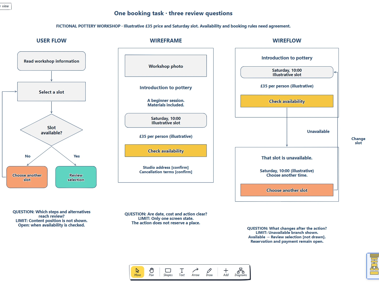
The visitor's task stays the same across the board. Each section has its own review question and a note explaining what it leaves out.
Choose a user flow for the route
Suppose the unresolved question is “What happens when the chosen slot is unavailable?” Start with the steps. The flow runs from reading the workshop information to selecting a slot, then asks whether that slot is available.
The available branch reaches Review selection. The unavailable branch reaches Choose another slot and returns to selection. That return route gives the team something concrete to follow: the visitor can make another choice without starting the whole task again.
At this stage, the team can discuss where the availability check belongs and which outcomes matter. Write the rule beside the decision. The diamond names a question; it does not establish how capacity is checked or whether the answer remains valid later.
The flow leaves the placement of the price and date choice unresolved. If the review asks “Will the visitor notice the cost before continuing?”, sketch the relevant screen. More flowchart boxes will not show where that information sits.
Choose a wireframe for the information on a screen
The middle section takes that content question. It shows the workshop photo placeholder, title, beginner description, date choice, price and Check availability action on one rough screen. The address and cancellation notes remain visible as unresolved content.
Keep the price near the action so the reviewer can inspect the choice and its cost together. Use a concrete action label: Check availability explains the proposed next step more clearly than Continue. If your product reserves a place at that point, change both the label and the underlying rule before using this example.
Ask someone to describe what they can choose and what the action will do. If they miss the price, review its wording or position. If they ask whether the date is guaranteed, record the product question; moving a label cannot settle it.
This wireframe shows one state. It does not answer what appears while the availability check runs or after it returns an unavailable result. Those questions call for connected states.
For a fuller walkthrough of choosing content and arranging a booking screen, follow the low-fidelity wireframe guide. It includes a separate editable starter and review worksheet.
Choose a wireflow for the action and its response
The right section keeps enough of the booking screen to preserve context: workshop name, chosen slot, price and action. An arrow starts at Check availability and leads to the proposed unavailable state. That state keeps the selected time visible, explains the result and offers Choose another slot.
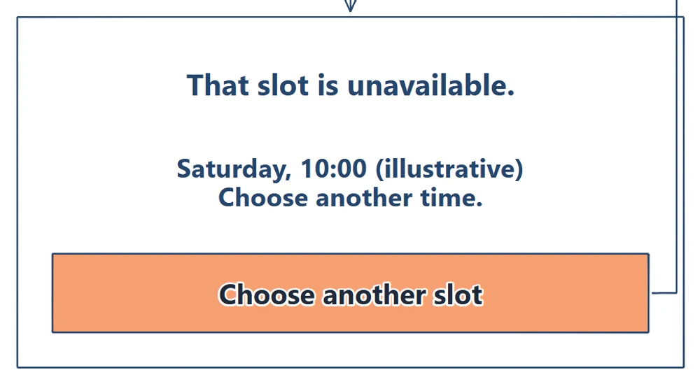
The changed message belongs to a particular selected slot. The recovery action returns to date selection, so the visitor can make another choice.
Follow the arrow back from Choose another slot to the date control. Now the team can review the information retained during recovery as well as the order of the steps. This is where the screen context adds to the abstract flow.
The example draws the unavailable branch. Its note names the available destination, Review selection, without drawing that screen. Add the available state if it becomes part of your review question. Also decide whether waiting, a failed check or a changed selection needs its own state. An unavailable slot and a failed request need different explanations.
A wireflow is useful when those changes matter to the discussion. For a broad route across many screens, showing every layout can make the sequence difficult to scan. Keep the view to the states needed for the question and record what remains outside it.
Use the interface state board to inventory waiting, completed and failed responses before choosing which connected states to draw.
Choose the smallest useful review
You can start with any of these formats. If the sequence is already agreed and the price is hard to find, open the wireframe. If a clear screen leaves the team unsure about an unavailable result, connect the relevant states. You do not need to create all three for every feature.
Use this comparison board as a template: replace the shared task and review question first, then adapt the section you need. Keep the same action names and product rules when moving between representations so a reviewer can compare them.
Give the drawing to a teammate with one question. Ask them to point to the information that answers it and to anything still undecided. Record the next change with an owner. Review the proposed behaviour with intended users and test the implementation; a clear diagram alone does not establish that the booking journey works.
If the task, evidence or boundaries are still unclear, write a one-page design brief to agree the problem and next investigation before choosing a drawing.
Review checklist
Before sharing your user flow, wireframe or wireflow, check:
- The person's task and the team's review question are distinct and specific.
- The start, endpoint and states shown have clear boundaries.
- A user flow names meaningful decisions and alternative routes.
- A wireframe contains the information and controls needed for its task.
- A wireflow identifies the triggering action and the changed state.
- Recovery has a destination, and undrawn branches are labelled.
- Names and product rules agree across related drawings.
- Fictional content, open rules and the next decision's owner are visible.
Copy this worksheet for your review:
Person and task:
Question the team needs to answer:
Chosen format / reason:
Starting point / endpoint or state boundary:
Information or behaviour to show:
Alternative route or recovery:
What this drawing leaves out:
Open rule / owner / next review date:
Implementation or user check needed:
Optional: create the example with an AI assistant
MCP connects an assistant to EpicDraw's diagram tools. If your assistant supports remote MCP with OAuth sign-in, it can create an editable draft of this comparison board.
Use a free EpicDraw account, enable cloud sync and approve permission to create and edit diagrams. Open More, choose Connect AI assistant and add https://epicdraw.app/mcp in your assistant. Only synced pages are available to the remote server. The MCP connection guide explains the steps.
Paste this prompt into the connected assistant:
Using the connected EpicDraw MCP server, create a new editable page named "Three-part comparison board". Leave existing pages unchanged.

Create a three-part comparison board for the same fictional pottery workshop booking task. Show a user flow as steps and decisions, a wireframe as one screen layout, and a wireflow as connected screen states. Give each representation a distinct review question and label its limits.

Use editable shapes, text and connectors. Label the example as fictional and mark unknowns as open questions. This is a visual planning draft. Check for overlapping objects and overflowing labels, then return a PNG preview and the private editor link. Leave the result as a draft for me to review.
Inspect the preview and open the private editor link while signed in. Check that the three sections use the same task and distinguish checking availability from making a reservation. Layouts may differ from the screenshots. The assistant creates planning drawings; it does not build a booking service or verify real availability.
Takeaways
- Choose the format from the question the team needs to answer.
- Use a flow for the route, a wireframe for screen content and a wireflow for action-to-state changes.
- Keep the task and product rules consistent across drawings.
- Show recovery and label the limits of the view.
- Turn review questions into owned decisions and implementation checks.
Keep your next draft close
Create a free account to save your pages in the cloud and use them across devices.
Create a free accountYou can keep drawing without an account.