
A pricing page wireframe helps your team agree what someone needs to compare before choosing a plan. It gives each plan a place in the layout and makes gaps in pricing, limits and billing visible while the page is easy to change.
Start with the same questions for every plan. Name the intended user, what they can do and how the charge is measured. Then arrange those answers into a comparison your teammate can explain. This guide includes an editable pricing page wireframe template and a worksheet for the decisions that remain open.
What the comparison needs to show
A plan name tells someone little on its own. A person choosing between subscriptions needs to understand which one fits their work, what limits apply and what they would pay for that use.
The wireframe shows where those answers belong. Keep the layout rough and the labels specific. Figma's introduction to low-fidelity prototyping describes wireframes as simple representations of screen layout and content hierarchy. Here, the hierarchy should help someone compare the same information across plans.
If one plan says "projects" and another says "storage", the page still owes the reader a projects answer for the second plan. A tick beside "Collaboration" needs an explanation of what collaborating allows.
For the basic sketching method, follow how to create a low-fidelity wireframe to turn a task and content list into a rough screen for review.
Choose the people and the decision
Our worked example is a fictional project-planning product with Starter and Team plans. Starter proposes a personal workspace; Team proposes shared editing. Prices, usage limits and billing details are deliberately unconfirmed. These are planning choices for review, not a real subscription offer.
We will compare two situations: a person planning their own projects and colleagues who need to edit shared work. The visitor wants to choose a suitable plan. Your team's job is to give them enough information to make that choice and understand what follows.
Write this review question beside the sketch: "Can readers explain which plan suits their use?" Under it, record the two situations. They give you a reason to include collaboration and a way to check whether a plan description means anything.
For a reporting tool, you might distinguish someone reading reports from someone preparing them. Confirm those roles with the product team before publishing the copy.
Turn the decision into matching rows
Use the same comparison rows for both plans. Our pricing page wireframe example starts with this worksheet:
| Comparison row | Starter proposal | Team proposal |
|---|---|---|
| Intended user | One person planning projects | Colleagues planning together |
| Usage limit | Active projects: confirm | Active projects: confirm |
| Collaboration | Personal workspace | Shared editing |
| Price and billing unit | Confirm price, unit and period | Confirm price, unit and period |
| Main action | Choose Starter | Choose Team |
The product team needs to confirm those uses, how projects are counted, what guests or members can do, what each person's use would cost and where selection leads.
Define a limit as well as naming it. "Active projects" might mean projects not archived or projects edited during a period. Settle the rule before the page can explain it.
Use plain descriptions of access. If Team includes shared editing, record whether every member can edit and whether guests count towards a member limit. A vague "More collaboration" label leaves those questions unanswered.
Give unknowns an owner and replace them with verified answers before presenting the page as an offer.
Build the comparison in EpicDraw
You have the situations and the rows. Now arrange the plans so someone can compare them without searching for equivalent answers.
Open the editable starter near the top of this guide. It adds a fresh page alongside your existing drawings and works without an account. Replace the bracketed labels with your own plan names and the information your team has agreed.
The worked layout puts Starter and Team side by side. Matching rows appear in the same order and at the same height. Each card carries its own row labels, so the meaning can remain clear when the cards are stacked on a smaller screen.
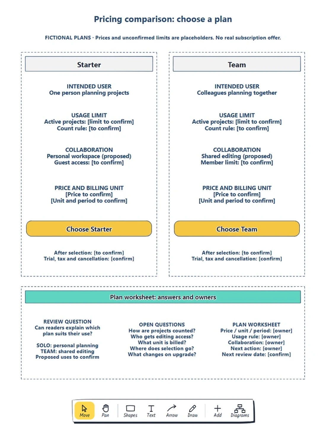
The complete worked example, captured from the EpicDraw editor. Matching rows make differences visible; the worksheet keeps undecided rules with the team.
Double-click a label to edit it. Change the intended user first, then the usage and collaboration descriptions. Move shapes if a longer answer needs more room, keeping the corresponding row easy to find in the other plan.
Download the worked example to compare it with your starter. Keep review notes outside the cards to distinguish proposed visitor-facing content from team questions.
Make the billing basis explicit
With the layout in place, follow the price row as the person choosing a plan. A price needs a unit and a period: per member per month, per workspace per year or whatever your product actually uses.
Our example leaves those fields open. Ask the responsible owner for the price, what it covers and the billing period, then keep those details together.
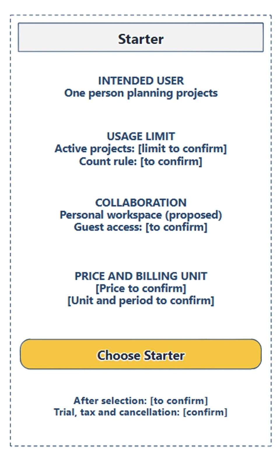
The Starter card names the information behind the choice. The price, billing basis and conditions still need confirmed answers before someone can judge the cost.
Check what changes when the person's use changes. If the price is per member, the number of billable members affects the total. If a workspace price includes some members, show the included number and how extra members are charged once those rules are agreed.
If you offer monthly and annual billing, sketch what each choice changes. A monthly equivalent and an annual charge describe different things; label the period and the amount charged clearly. Do not assume a switch changes every plan in the same way.
Record questions about tax, trial requirements, renewal and cancellation beside the relevant action or price. Ask their owners to confirm the terms, then keep each requirement near the choice it affects.
Review the plans with both situations
Ask a teammate to read the sketch as the solo planner first. Which plan appears to fit, and what still prevents a decision? Then repeat the task for colleagues who need shared editing. Let them explain the choice before you explain the cards.
In our proposal, the personal and shared-workspace descriptions suggest different uses. Neither person can finish a cost comparison while the price and limits remain unknown. Write down that gap instead of treating it as a layout problem.
If the reviewer misses an existing answer, try clearer wording or another position. Assign missing answers to their owners. Moving the price block cannot settle the billing unit.
Sketch a mobile order too. Keep the plan name with its comparison labels and action, then check whether someone can find the equivalent information in the next plan. A wider comparison table may need another arrangement; the questions should survive the change in layout.
This colleague review helps the team find questions and explain the proposed plans. Test an appropriate prototype with intended customers when you need evidence about how they understand the offer. The sketch alone does not establish conversion or revenue gains.
Follow selection and upgrade questions
What happens after "Choose Starter" or "Choose Team"? The product might ask for an account, show a billing summary or offer a trial. Record the destination beside the action.
Draw the next state beside the comparison and connect it to the action. Nielsen Norman Group's explanation of wireflows describes combining screen layouts and flow connections to show interactions. Use that approach when a plan card cannot explain the next step.
For an existing customer, ask what upgrading changes: access, limits, billing and the effective date. Review that behaviour separately from a new customer's signup path. The yellow actions are editable labels; your product still needs to implement selection and billing.
If choosing a plan leads to account creation, use how to map a signup flow to work through registration, verification and recovery before designing that destination.
Review checklist
Use this pricing page wireframe checklist before sharing:
- Name the situations each plan is intended to support.
- Use matching comparison rows and explain any missing answer.
- Define usage limits and how they are counted.
- Explain collaboration and who gets access.
- Keep price, billing unit and period together.
- Record trial, tax and other relevant conditions with an owner.
- Check both situations on desktop and mobile.
- Follow plan selection to its destination and record upgrade questions.
Copy this worksheet to turn the review into the next draft:
Person's situation:
Plan that appears to fit, and why:
Comparison row still unanswered:
Price, billing unit and period:
How a limit is counted:
What happens after selection:
Upgrade or billing question:
Next decision, owner and review date:
Save the editable page for later changes. EpicDraw's backup instructions explain how to keep a native copy with its shapes and labels.
Optional: create the example with MCP
If your AI assistant supports remote MCP with OAuth sign-in, you can ask it to create a pricing comparison draft in EpicDraw. MCP connects the assistant to EpicDraw's diagram tools.
Use a free EpicDraw account, enable cloud sync and allow the assistant to create and edit diagrams when approving the connection. Only synced pages are available to the remote server. Add https://epicdraw.app/mcp using the MCP connection guide.
Paste this prompt into the connected assistant:
Using the connected EpicDraw MCP server, create a new editable page named "Pricing comparison wireframe and plan worksheet". Leave existing pages unchanged.

Sketch a pricing comparison for fictional Starter and Team plans. Use the same comparison rows for intended user, usage limits, collaboration, billing unit and main action. Leave prices and unconfirmed limits as clearly marked placeholders. Add a question about which plan fits each use case.

Use editable shapes, text and connectors. Label the example as fictional and mark unknowns as open questions. This is a visual planning draft. Check for overlapping objects and overflowing labels, then return a PNG preview and the private editor link. Leave the result as a draft for me to review.
Inspect the returned preview and open the private editor link while signed in. Check the row labels, placeholders and review question before adapting the result. Assistant layouts vary. The prompt creates a planning diagram; it supplies no verified prices and does not create a working subscription or billing system.
Takeaways
- Choose comparison rows from the situations your plans need to support.
- Keep equivalent answers easy to find across plans, including on mobile.
- Treat unknown prices, limits and billing rules as decisions with owners.
- Use the review to distinguish missing answers from content or layout problems, then follow the chosen plan to its next state.
Keep your next draft close
Create a free account to save your pages in the cloud and use them across devices.
Create a free accountYou can keep drawing without an account.