
A product page wireframe helps your team agree what a shopper needs to know before choosing an item. It gives the product information, options and buying action a place on the page while the layout is still easy to change.
This guide walks through making one: define the buying task, list the questions the page must answer, arrange the content and review a purchase with a teammate. The editable starter gives you a layout to adapt as you go.
What the wireframe needs to show
The wireframe shows the information and choices that support a purchase. Boxes stand in for photographs and controls; labels explain what belongs inside them. Your team can discuss whether the shopper has enough information before working on the visual design.
Figma's introduction to low-fidelity prototyping describes wireframes as simple representations of screen layout and content hierarchy. Keep yours rough enough to move things around, but give the content enough meaning to review.
A box labelled "Product details" hides several decisions. Does it contain the measurements someone needs, a materials list or a description of the product's use? Name the information so the team can tell what it answers.
For a broader walkthrough of choosing content and arranging a rough screen, follow how to create a low-fidelity wireframe before working through the example below.
Start with one buying task
Our worked example is an Everyday backpack. The product, £49 price and 18L and 24L options are fictional. Measurements, stock, delivery and returns remain open questions in the sketch.
Imagine a shopper choosing a commuting backpack for a 13-inch laptop. The designer's job is to help them judge whether it suits that task and understand the next step. Write the shopper's task in the margin, followed by the review question: "What would stop a shopper choosing this item?"
That task gives you a reason to include particular content. The shopper needs useful internal measurements or a clear laptop-fit statement. A capacity label alone does not answer whether their laptop fits. A photograph of the bag being worn can show its scale; a compartment view can show where things go.
Use a task appropriate to your product. A chair shopper might need seat height; a clothing shopper may need a size guide. Let those questions determine the content.
Turn the questions into content
With a task in mind, make a small content list before arranging the page. This product page wireframe example uses the following questions:
| Shopper's question | Content to show | What is still needed |
|---|---|---|
| Will this suit my commute? | Useful photo views and laptop-fit information | Verified internal measurements |
| Which version am I choosing? | Selected colour, size and availability | Stock for that combination |
| What will it cost to receive it? | Product price and delivery estimate | Charge, arrival date and conditions |
| What if it does not suit me? | Returns summary or a clear policy link | Window, cost and conditions |
Mark missing facts as questions beside the relevant part of the drawing. "Internal measurements: to confirm" tells the product team what to supply. It also lets a reviewer say that the buying task remains unanswered.
Check each answer with its owner. If a delivery estimate needs a postcode or selected option, show where the shopper provides it and when the answer appears. Keep conditions with the estimate.
Build the product page in EpicDraw
Now use that content list to arrange the page. Open the editable starter near the top of this guide. It creates a fresh page alongside your existing drawings, and you can edit it without an account.
The worked layout puts the photo and fit information on the left. The right-hand panel holds the product name, price, selected options and buying action. Delivery and returns sit directly below that action, where the shopper can check them while deciding.
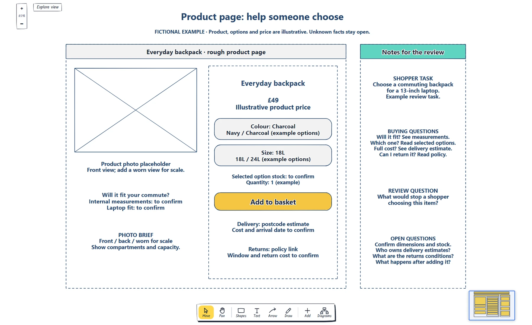
The complete worked example, captured from the EpicDraw editor. The margin connects the shopper's task to the content on the page.
Double-click a label to edit it. Replace the bracketed fields in the starter with your product information, then change the task in the notes. Move the shapes if the new task calls for a different order.
Keep the photo placeholder specific. In this example, the photo brief asks for front, back and worn views, plus compartments and capacity. The sketch helps your team agree what those images need to demonstrate before anyone prepares them.
Download the worked example from the quick-start panel to inspect the filled-in version alongside your starter.
Check the information beside the buying action
You have a first layout. Follow the right-hand panel as the shopper would: identify the product, read the price, choose a version and decide whether to add it to the basket.
Name the selected colour and size as well as the available choices, so the reviewer knows which version they are adding. Ask what changes with another combination, including price, photographs and stock information.
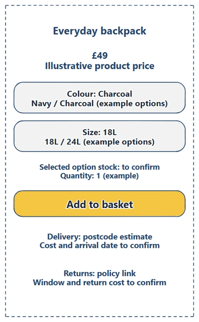
The buying panel keeps selected options and supporting information together. Unknown delivery and returns details remain visible for the team to resolve.
"Shipping available" leaves the shopper without a charge or arrival estimate. Show the answer and its conditions, or how to request an estimate when information is missing.
Baymard's product-page research recommends an order-cost estimate near the buy section and a returns summary or policy link in the main product-page content. Use those as questions for your layout: can the shopper find the cost information here, and can they reach the returns terms?
In our example, the policy link is a placeholder and the returns window and cost still need an owner. Avoid filling that space with an invented policy just to make the wireframe look complete.
Review one uncertain purchase
Ask a teammate to imagine buying the backpack for their laptop commute. Let them read before you explain. Ask which version they would choose, what they expect to pay and what still needs answering.
Record each question beside the content it concerns. "Will the laptop fit?" goes near the measurements. "Does that include delivery?" goes near the price and delivery information.
Then separate two kinds of change. If the answer exists but is hard to find, move or rewrite it. If nobody knows the answer, give the missing fact an owner. Changing the layout cannot settle a delivery promise or supply an internal measurement.
Repeat the task with a mobile layout. Stack the photo, fit information and buying panel, keeping options, action and delivery information together. Use the same questions to check the order.
This colleague review helps you identify questions to resolve. It does not establish how customers will behave or whether sales will increase. Use a suitable prototype and real shoppers when you need evidence about the finished experience.
Show what changes after a choice
Some review questions need another state. What appears after adding the backpack? How does an unavailable option look? What happens when a delivery estimate cannot be calculated?
Draw the state and connect it to the action that leads there. Nielsen Norman Group's explanation of wireflows describes combining screen layouts with flow connections to communicate interactions. Sketch an unavailable selection or basket confirmation and follow it with your teammate.
Write down unresolved behaviour so the implementation team can decide it. A yellow "Add to basket" shape in the drawing is a visual label; your store still needs to implement the action.
Review checklist
Use this checklist before sharing your product page wireframe:
- Name the shopper's task and the question you want the review to answer.
- Specify what each photo should demonstrate.
- Include the facts needed to judge product fit.
- Make selected options and their availability clear.
- Show the price and where delivery cost and timing are answered.
- Give returns information a clear summary or destination.
- Trace a changed selection and the state after the buying action.
- Give each missing fact an owner and a next step.
Copy this worksheet to record a review:
Shopper's task:
Question before buying:
Content that answers it:
Selected option and expected next step:
What the reviewer could not find:
Missing fact or layout change:
Owner and next review date:
Keep the editable page for later changes and export a native backup when you need a copy. See EpicDraw help for backup instructions.
Optional: create the example with MCP
If your AI assistant supports remote MCP with OAuth sign-in, you can ask it to create a first draft in EpicDraw. MCP connects the assistant to EpicDraw's diagram tools.
Use a free EpicDraw account, enable cloud sync and allow the assistant to create and edit diagrams when you approve its connection. Only synced pages are available to the remote server. Add https://epicdraw.app/mcp to your assistant using the MCP connection guide.
Paste this prompt into the connected assistant:
Using the connected EpicDraw MCP server, create a new editable page named "Adapt product-page-wireframe with buying questions". Leave existing pages unchanged.

Sketch a product page for a fictional backpack. Include a photo placeholder, product name, an illustrative price in pounds, colour and size choices, delivery information, returns questions and an add-to-basket action. Annotate which information supports each buying decision; label prices as illustrative.

Use editable shapes, text and connectors. Label the example as fictional and mark unknowns as open questions. This is a visual planning draft. Check for overlapping objects and overflowing labels, then return a PNG preview and the private editor link. Leave the result as a draft for me to review.
Open the preview and private editor link to check the labels and open questions. Assistant layouts vary, so the prompt may produce a different arrangement. Confirm the product facts before adapting the draft; it does not create a working shop.
Takeaways
- Choose the content from a shopper's task before arranging the page.
- Keep selected options, buying action and cost information easy to review together.
- Use questions to expose missing facts and assign them to someone who can answer.
- Draw another state when the review needs to follow a choice or action.
Keep your next draft close
Create a free account to save your pages in the cloud and use them across devices.
Create a free accountYou can keep drawing without an account.