
A landing page wireframe helps your team agree what a page needs to explain before someone takes the next step. It gives the offer, supporting information and action a place in the layout while the content is still easy to change.
Write who the page is for and what you want them to do. Use those answers to choose the content and its order. This guide follows that process with an editable landing page wireframe template and a reusable checklist.
What the wireframe needs to explain
A landing page presents an offer to someone arriving from a particular link or campaign. Choose one main action to review, such as trying a product or requesting a demonstration. That gives the team a clear decision to work towards.
The wireframe shows which information supports that decision. Boxes can stand in for images; labels explain what someone will learn there.
Figma's introduction to low-fidelity prototyping describes wireframes as simple representations of screen layout and content hierarchy. Make the content specific enough to discuss. A box labelled "Proof" leaves the team to decide what it proves and whether the evidence exists.
If you need the basic sketching method first, follow how to create a low-fidelity wireframe to turn a task and content list into a screen for review.
Choose the reader and action
Our worked example is a fictional scheduling product for independent tutors arranging lessons across separate messages. Its proposed page explains how a tutor could share available times with learners. The copy and behaviour are for review; a demonstration, customer evidence and practical terms still need confirming.
The tutor wants to understand how lesson scheduling would work and decide whether to try it. The designer's job is to make that choice possible from the page. Write the intended reader and their task in the notes beside your sketch.
Then choose the main action. Our example uses "Try a sample schedule". That label tells the team what needs to happen next: someone should reach a sample they can inspect or use. Whether the sample needs an account, what it contains and how it handles data remain open decisions.
Write the review question: "What does a tutor need to understand before trying it?" Use it to judge each section. Recruiting tutors as partners serves another purpose and needs a separate route.
Turn the promise into content
With the reader and action agreed, draft the explanation before arranging boxes. Our proposed headline is "Let learners choose a lesson time from your availability". It names an action the tutor can understand. The team must confirm that the product supports it before using the copy on a live page.
The proposed process is to share available times, let a learner choose a slot and review it in your schedule. That gives the demonstration something specific to show.
Use this content list to connect the offer to the tutor's questions:
| Tutor's question | Content to prepare | Decision still needed |
|---|---|---|
| Is this for my work? | Name independent tutors and lesson scheduling | Confirm the intended audience |
| How does it work? | Show availability, a learner's choice and the resulting schedule | Verify the product behaviour |
| What supports the promise? | A real demonstration and any relevant customer evidence | Supply evidence and permissions |
| What happens if I try it? | Explain the sample, account requirements and relevant terms | Agree the next step |
Adapt the questions to your reader. A waiting-list page needs to explain what updates someone will receive; a demonstration request needs to say what the meeting covers and how it is arranged.
Build the layout in EpicDraw
Now arrange the content around the decision. Open the editable starter near the top of this guide. It adds a fresh page alongside your existing drawings, and you can edit it without an account.
The example puts the reader, promise and action at the top, beside the demonstration. The process follows, then evidence and practical questions. Review notes sit outside the page to distinguish team decisions from visitor-facing copy.
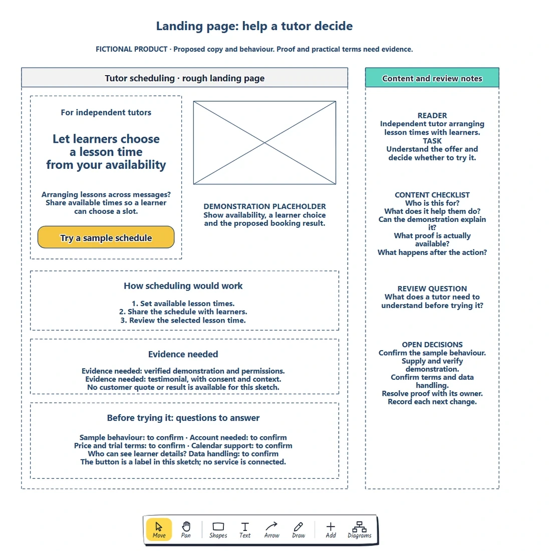
The complete worked example, captured from the EpicDraw editor. The notes connect each section to something the tutor needs to understand.
Double-click a label to edit it. Replace the bracketed reader and promise, then name the action. Move shapes when the content needs a different order. Download the worked example from the quick-start panel to compare it with your starter.
Check whether the opening makes sense without the notes. If the demonstration must explain an unfamiliar process first, give it more space or move it ahead of the action.
Draft proof and practical details
Use the supporting sections to specify content the team still needs to prepare.
Our demonstration asks for the tutor's availability, a learner selecting a time and the proposed booking result. A generic dashboard image leaves that process unexplained. Check the proposed demonstration against the actual product.
Keep the proof area labelled "Evidence needed" while the evidence is missing. Record the source, what it supports and who can confirm permission to use it. A testimonial needs a real quotation and context; a measured result needs its method and scope. Leave unsupported claims out of the page you eventually publish.
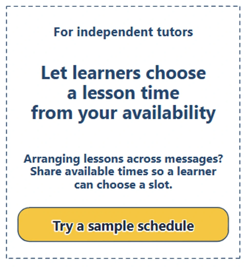
The opening connects the reader to a specific promise and action. The rest of the page must explain how that action works and what trying it requires.
In this example, the practical questions include account requirements, price or trial terms, calendar support and who can see learner details. Give each unknown an owner. If trying the sample requires a condition, put that condition near the action once it is agreed. Moving a button cannot answer an undecided pricing or data-handling question.
Review the order of information
Ask a teammate to read the sketch as an independent tutor. Let them explain who it is for, what the product would help them do and what they expect after pressing "Try a sample schedule".
If they cannot describe scheduling, revisit the process or demonstration. If trying it is unclear, review the action and practical details.
Separate missing answers from answers that are hard to find. The first needs a decision or evidence from its owner; the second may need clearer wording or another position. Use that distinction to choose your next change.
Sketch a mobile order: reader and promise, demonstration, process and relevant conditions. Place the action where someone has enough information to judge it, then repeat the task to check the order.
The colleague review identifies questions to resolve. Test an appropriate prototype with intended visitors to learn how they understand the offer. A wireframe review alone provides no evidence of traffic, leads or conversion gains.
Follow the action to its next state
The review may expose a gap beyond the page. Does the button open a sample schedule, ask for an account or lead to instructions? Sketch the proposed destination beside the landing page and connect it to the action. Keep unsettled behaviour visible until the team agrees it.
Nielsen Norman Group's explanation of wireflows describes combining screen layouts with connections that show interactions. Use that approach when a single page cannot explain what follows. The action shape in this example is an editable label; your website still needs to implement the agreed behaviour.
If trying the product requires an account, use how to map a signup flow to agree registration, verification and recovery before designing that next step.
Review checklist
Use this landing page wireframe checklist before sharing:
- Name the intended reader and the decision the page supports.
- Write a promise whose meaning and product support can be checked.
- Give the main action a label that describes the next step.
- Specify what the demonstration must explain.
- Keep missing proof labelled and assign its owner.
- Put relevant requirements beside the action they affect.
- Review the information order on desktop and mobile.
- Follow the action to its destination and record unanswered questions.
Copy this worksheet to carry the review into your next draft:
Intended reader:
Reader's task or decision:
Proposed promise:
Main action and destination:
Demonstration needed:
Evidence, source and permission:
Conditions still to confirm:
What the reviewer could not explain:
Next change, owner and review date:
Keep the editable page so you can revise the content after those decisions. Use EpicDraw's backup instructions to save a native copy with its shapes and labels.
Optional: create the example with MCP
If your AI assistant supports remote MCP with OAuth sign-in, you can ask it to create a draft in EpicDraw. MCP connects the assistant to EpicDraw's diagram tools.
Use a free EpicDraw account, enable cloud sync and allow the assistant to create and edit diagrams when approving the connection. Only synced pages are available to the remote server. Add https://epicdraw.app/mcp using the MCP connection guide.
Paste this prompt into the connected assistant:
Using the connected EpicDraw MCP server, create a new editable page named "Landing page wireframe and content checklist". Leave existing pages unchanged.

Sketch a landing page for a fictional scheduling product for independent tutors. Include the intended reader, the problem, how scheduling works, a demonstration placeholder and one try-it action. Leave proof and testimonial areas labelled "Evidence needed"; do not invent customer quotes or results.

Use editable shapes, text and connectors. Label the example as fictional and mark unknowns as open questions. This is a visual planning draft. Check for overlapping objects and overflowing labels, then return a PNG preview and the private editor link. Leave the result as a draft for me to review.
Inspect the preview and open the private editor link while signed in. Check the promise, action and evidence gaps before adapting it. Assistant layouts vary, and the prompt creates a planning diagram rather than an implemented website or scheduling product.
Takeaways
- Choose the reader and action before deciding which sections belong on the page.
- Use the promise to specify what the process and demonstration must explain.
- Give missing proof and practical terms an owner instead of filling the gaps with invented claims.
- Let the review determine the next content or layout change, then follow the action beyond the page.
Keep your next draft close
Create a free account to save your pages in the cloud and use them across devices.
Create a free accountYou can keep drawing without an account.