Design
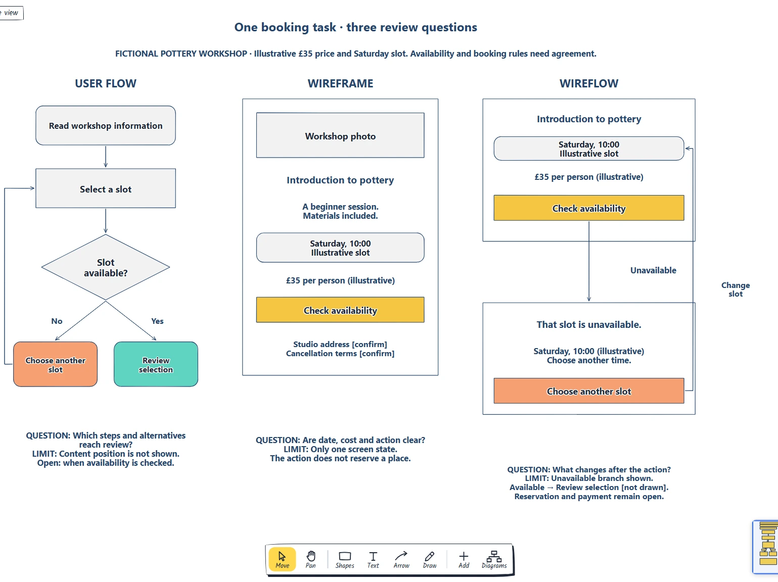
Three-part comparison board template
Name the review question. · Compare steps screens and transitions. · Do we need to discuss sequence, content or both?
Preview and use template →An ecommerce user flow follows one shopper through the screens and decisions between arriving and buying. It helps designers and product teams see where the path branches and where people give up. This example starts at a rain jacket ad, runs through collection, search, product page, basket and checkout, and marks four exits with the reason behind each.
No account needed · Opens as your own editable page
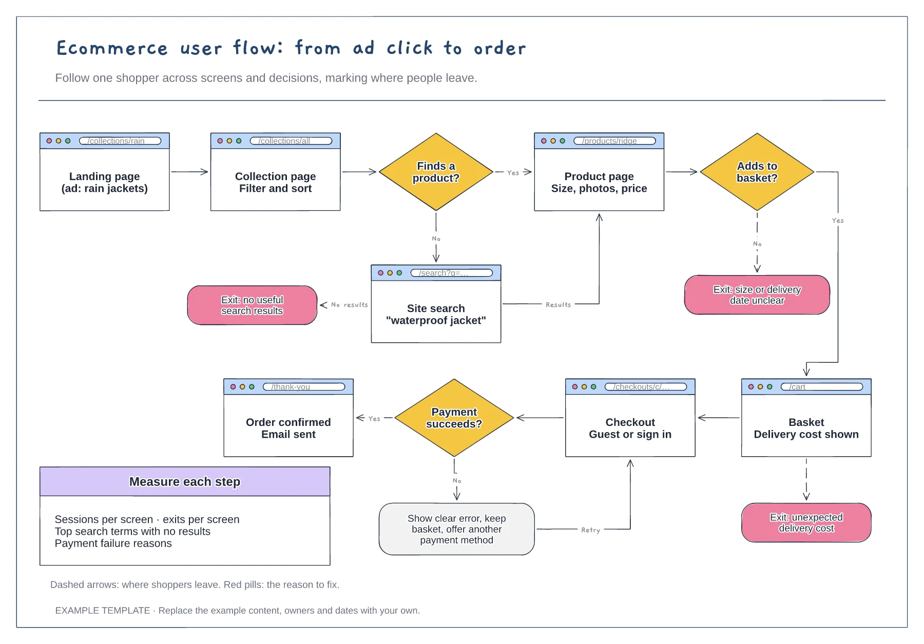
Pick the landing page your traffic actually arrives on, such as an ad, an email or a search result. Flows that begin at the home page often miss the shortcut most shoppers take.
For each decision, add the No branch and say why someone would leave at that point. A labelled exit such as "delivery cost unexpected" points to a fix, where a bare drop-off number does not.
Compare each screen with its page views and exit rate for the same period. If the data shows a path you have not drawn, such as search used straight from the home page, add it.
They are the places where shoppers leave, each with the reason to fix. Add your own from analytics or session recordings and remove any that do not apply.
No. Open the template and edit it in your browser. Your work saves on this device. An account is optional if you want to sync your workspace.
Yes. Use Export in the editor to save a PNG, SVG or PDF, or download an editable .epicdraw backup.
Name the review question. · Compare steps screens and transitions. · Do we need to discuss sequence, content or both?
Preview and use template →
Define the starting point, task and confirmed end state. · Give each decision explicit outcomes. · Explain address correction and return routes.
Preview and use template →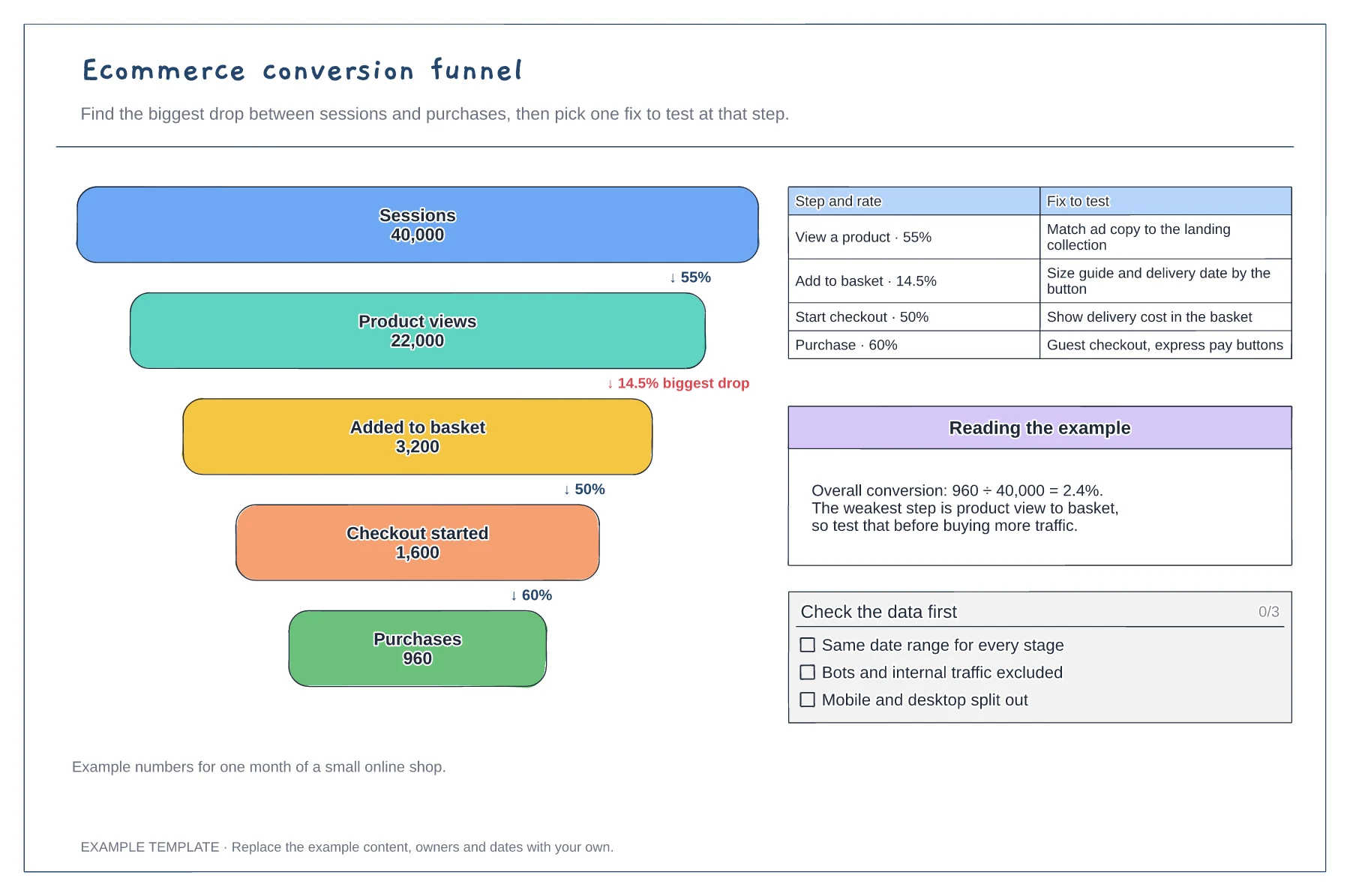
Five funnel stages with counts · Step rates and the biggest drop · A fix to test at each step
Preview and use template →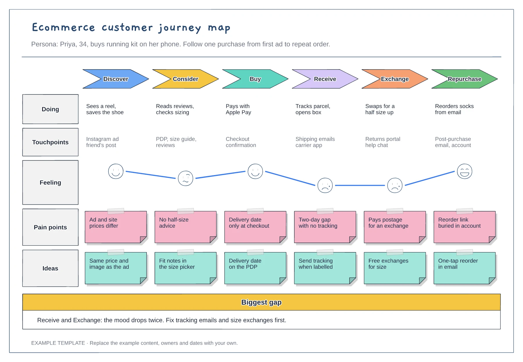
Six stages from discover to repurchase · Touchpoints and an emotion curve · Pain points paired with ideas
Preview and use template →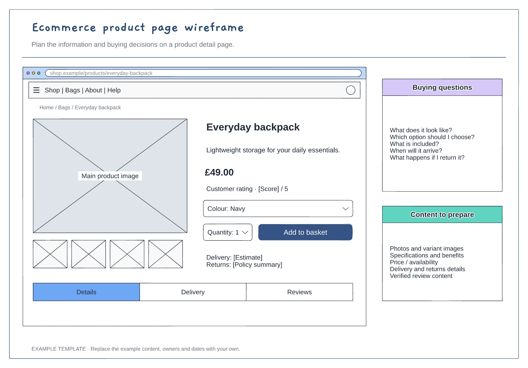
Product gallery and buying panel · Delivery, returns and trust information · Details and supporting content
Preview and use template →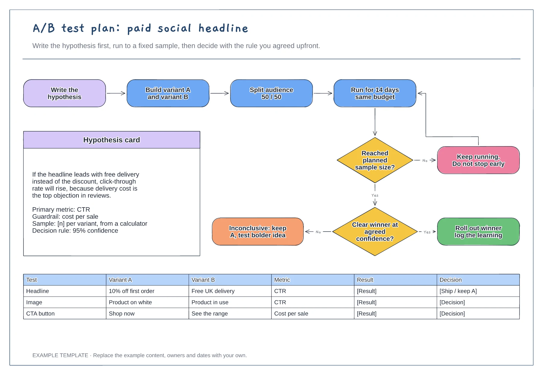
Hypothesis card with metric and guardrail · Decision flow with a no-peeking loop · Test log for variants and results
Preview and use template →