
A website sitemap helps your team agree where information belongs and how visitors will find it. For a UX designer, it gives page names and navigation labels a purpose before you start arranging menus or drawing individual screens.
List the visitor questions, put each beside the page that should answer it, then check how someone would reach that page. This guide builds a website sitemap example and reviews its labels and routes. Open the editable starter to adapt the method to your site.
Understand what the sitemap decides
A visual sitemap shows a website's pages or content groups and their relationships. Explain what a box and a branch mean on your drawing so a reviewer can follow it.
The structure and the menu are related decisions. Nielsen Norman Group distinguishes information architecture from navigation: the organisation of content informs the interface elements people use to reach it. A page can have a place in the structure without needing its own item in the main menu. It might be reached through a section link, a footer or an account control.
The visual diagram in this guide is for planning that structure. A search-engine sitemap is a separate file describing site resources for crawlers, as Google Search Central explains. Drawing boxes here does not generate that file or establish whether pages will appear in search results.
Include the pages needed for the tasks in scope, and mark sections whose contents are still unknown. Expand the diagram when you have those answers.
Start with the pages visitors need
Our worked example is a fictional scheduling SaaS website for independent tutors. The team has an outline of the offer, proposed plan information and some setup guidance. It needs to agree where a new visitor can compare plans, where a new user can learn the setup process and how a returning user reaches their schedule. Product details and account behaviour remain open questions.
Your job is to organise the site; the tutor needs an answer or access to their account. Write the audience and tasks beside the sitemap so the team can judge page names against them.
Make an inventory before drawing the branches:
| Page or group | Visitor needs it to | Proposed navigation |
|---|---|---|
| Home | Understand the offer and choose where to go | Logo or Home link |
| How it works | Understand the setup process | Main navigation |
| Pricing | Compare plans and what they include | Main navigation |
| Help | Find detailed setup and troubleshooting guidance | Main navigation; relevant page links |
| Account access | Reach an existing schedule | Utility link labelled Sign in |
If the team proposes a page called “Solutions”, ask which visitor question it answers and what belongs there. An internal team name may mean little to a new visitor.
The inventory exposes missing material too: plan details, a setup explanation, help guidance and account destinations. Record a content owner for those answers; a new label cannot supply missing content.
Group pages and choose useful labels
With the inventory in place, decide which pages belong together. In this example, the small public site can keep How it works, Pricing and Help one level below Home. Account access is drawn at the same level to show the public entry point; its place in a utility area is a separate navigation choice.
This shallow structure is a proposal for this small site. A larger help collection might need topic groups and child pages. Add branches when they help someone find an answer, and check the group names with the intended reader.
Use the inventory to choose labels. “Pricing” tells someone comparing plans where to look. “How it works” introduces the process. “Help” is broad, so the page will need clearer topic names inside it. The sample proposes getting-started and connection-troubleshooting guidance; the team still needs to confirm those contents.
Keep “Account access” as the planning name for that area and “Sign in” as its proposed visible control. The distinction records what the group contains and what the returning tutor would see. Confirm the wording and destination before using it on the website.
Draw the structure in EpicDraw
Open the website sitemap template near the top of this guide. It adds a fresh editable page and preserves your existing drawings. The starter contains page boxes, connections and bracketed fields for the tasks you want to review. You can also download the worked example and open it with the app's Import option.
The example places Home above the other pages. Its connectors represent hierarchy. Notes inside each box explain the visitor task it serves, while the review cards below record specific paths to check.
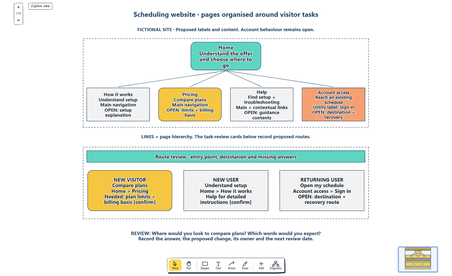
The branches show the proposed page structure. The cards below turn that structure into routes a teammate can review; they are separate from the hierarchy lines.
Double-click a label to edit it. Replace the audience and page names, then add each visitor question. Move the boxes to try another grouping, leaving room for descriptions and connections.
Avoid using an arrow to mean several things at once. A hierarchy line says where a page belongs. A task sequence says where someone goes while trying to get something done. Figma's explanation of user flows makes that distinction: flows follow tasks and actions, while sitemaps describe content organisation. Keep a legend, or draw a separate flow when the behaviour needs more detail.
Trace the routes through the site
Use the visitor questions to check the labels and paths. Start from a realistic entry point: a new visitor arriving at Home and a returning tutor using Sign in need different routes.
Our example records three tasks:
- A new visitor wants to compare plans. From Home, they choose Pricing and look for plan limits and the billing basis.
- A new user wants to understand setup. From Home, they choose How it works, with a link to Help when detailed instructions are needed.
- A returning user wants to open their schedule. They use the proposed Sign in control; the account destination and recovery route still need agreement.
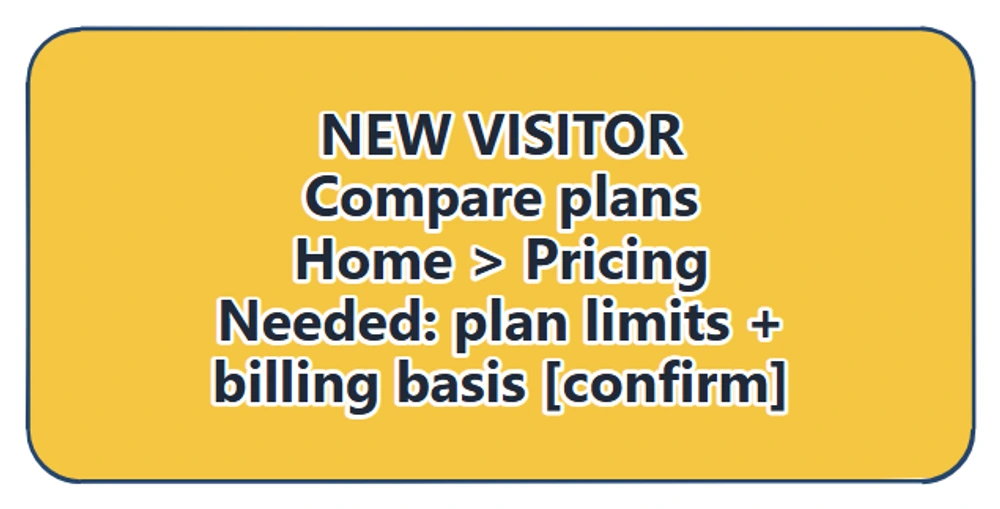
The pricing route has a clear destination, but the card also records what the visitor must find there. Reaching the right page is only part of the task.
Ask a teammate to choose a route without telling them which label to use. For the pricing task, say “You want to compare the available plans” rather than “Find the Pricing page”. Listen for the labels they expect, where they hesitate and what they need when they arrive.
This is a review of the proposed structure. A colleague's walkthrough can reveal questions, but it does not establish that intended users will understand the finished navigation. Review with those users when possible, then test the actual interface once the links and controls exist.
Turn questions into changes
Sort the review notes by the decision they affect. If someone looks for cost under How it works, compare the labels and consider a contextual pricing link there. If they reach Pricing but cannot compare the plans, the destination needs better content. If a returning user cannot recover account access, draw the missing behaviour separately.
Write each agreed change, its owner and the next review date beside the relevant box. Keep unresolved content and destinations visible during handover.
Then use the sitemap to sketch a page's navigation. Decide which links appear in the main menu, which belong in a utility area and which support a question within the page. On a narrow layout, check where those same destinations remain available. Removing a menu label from one position does not settle how someone should reach it.
Once the structure is agreed, follow how to create a landing page wireframe to arrange the offer, navigation and next action on the same fictional scheduling site.
Review checklist
Use this website sitemap checklist before moving to page layouts:
- Every page or group answers a visitor question in scope.
- Connections have one explained meaning.
- Planning names and proposed visible labels are clear.
- Each task has an entry point and a destination with the needed information.
- Missing content, account behaviour and deeper sections are visibly open.
- Review questions use the visitor's goal without giving away the label.
- Agreed changes have an owner and a review date.
Copy this worksheet for your next draft:
Audience and tasks in scope:
Page or group / question answered / content owner:
Proposed visible label and navigation location:
Task / entry point / route / needed destination content:
Unresolved content or behaviour:
Review observation / proposed change / owner / review date:
Next page layout or flow to draw:
Optional: create the example with an AI assistant
MCP connects an assistant to EpicDraw's diagram tools. If your assistant supports remote MCP with OAuth sign-in, it can create an editable draft of this sitemap for you to review.
Use a free EpicDraw account, enable cloud sync and approve permission to create and edit diagrams. Open More, choose Connect AI assistant and add https://epicdraw.app/mcp in your assistant. Only synced pages are available to the remote server. The MCP connection guide explains the connection and approval steps.
Paste this prompt into the connected assistant:
Using the connected EpicDraw MCP server, create a new editable page named "Editable sitemap and navigation checklist". Leave existing pages unchanged.

Create a sitemap for a small fictional scheduling SaaS website. Include Home, How it works, Pricing, Help and Account access. Connect them in a clear hierarchy and annotate the visitor task served by each page, including where a new visitor would find pricing.

Use editable shapes, text and connectors. Label the example as fictional and mark unknowns as open questions. This is a visual planning draft. Check for overlapping objects and overflowing labels, then return a PNG preview and the private editor link. Leave the result as a draft for me to review.
Inspect the preview, then open the private editor link while signed in. Check the hierarchy, visitor-task notes and pricing destination before adapting it. The assistant's layout may differ from the screenshots. The result is a planning diagram; it does not build a website, create working navigation or generate a search-engine sitemap file.
Takeaways
- Inventory visitor questions before choosing page groups and labels.
- Separate the content structure from the controls used to reach it.
- Check routes from realistic entry points and review the destination content.
- Use review notes to distinguish a label problem from missing content or behaviour.
- Carry the agreed structure into page layouts and more detailed flows.
Keep your next draft close
Create a free account to save your pages in the cloud and use them across devices.
Create a free accountYou can keep drawing without an account.