
Turning a desktop wireframe into a mobile layout helps your team check whether someone can still understand the page and take the next step on a narrow screen. The useful work is deciding what they need to read first and which information belongs beside the action.
Keep the visitor's task, list the information needed before acting, then arrange that content in a reading order. This guide follows one page through both layouts, with an editable desktop-to-mobile wireframe template and a checklist you can reuse.
What changes when the page gets narrower
A desktop layout can put an explanation beside a demonstration. On a narrow page, those sections often need to follow each other. That change exposes a decision: what must someone understand before the action makes sense?
The wireframe gives your team a place to discuss that order. Figma's introduction to low-fidelity prototyping describes wireframes as simple representations of screen layout and content hierarchy. Use the narrow sketch to review the hierarchy before refining the visual design.
Preserve necessary information as you move it. W3C's explanation of reflow describes presenting content without losing information or functionality, with exceptions for content that needs a two-dimensional layout. Moving a section can retain its meaning; deleting a requirement may change what the visitor understands.
Keep the task across layouts
Our worked example continues the fictional tutor-scheduling landing page. It proposes explaining how an independent tutor could share available times with learners, then inviting them to "Try a sample schedule". Product behaviour, evidence and the sample's requirements still need confirming.
The tutor's task stays the same in both layouts: understand the scheduling offer and decide whether to try it. Your job is to arrange the information so they can make that decision at either width.
Write the task beside both sketches. Add the review question: "Which content needs to stay near the action?" In this example, someone needs to understand the sample and any account, cost, calendar or data conditions before choosing it.
Use the same method for your page. A workshop visitor may need the date and price beside a booking choice. A product shopper may need the selected option and delivery information. The task determines what must remain available when the layout changes.
For the content decisions behind this same tutor example, follow how to create a landing page wireframe before deciding which information the narrow layout needs to preserve.
Choose a narrow reading order
List the desktop content before moving boxes. Give each block a purpose, then decide what the tutor should encounter first. This mobile wireframe example uses the following order:
| Content | Proposed narrow-page position | Why it belongs there |
|---|---|---|
| Reader, promise and problem | Opening | Explain who the page is for and what it proposes |
| Demonstration | After the opening | Show the scheduling process being described |
| Short process explanation | Before the try-it action | Explain what the sample is meant to demonstrate |
| Action and requirements | Together after the explanation | Let the tutor judge what trying it involves |
| Evidence | Following the action group | Keep supporting material available for review |
This order is a proposal to test. If the reader needs evidence before deciding, move it earlier. If the demonstration needs an introductory sentence, keep that explanation with it. Choose the order from the task and the questions people raise.
The desktop sketch also has an About label in its top navigation. The narrow version removes that label from the top row and keeps Help. Record where About should remain reachable if it is needed. Removing a label from one position does not settle the destination or justify losing necessary content.
Build the paired layouts in EpicDraw
You have the task and the content order. Now put the two versions beside each other so your teammate can follow what changed.
Open the editable starter near the top of this guide. It adds a fresh page alongside your existing drawings and works without an account. The page contains separate desktop and mobile boundaries, ready for your own labels.
The worked desktop layout puts the promise and try-it action beside the demo placeholder. Its narrow version stacks the promise, demo and process, then groups the action with the questions about trying it. Notes below the desktop sketch explain what moves, stays together or leaves the top navigation.
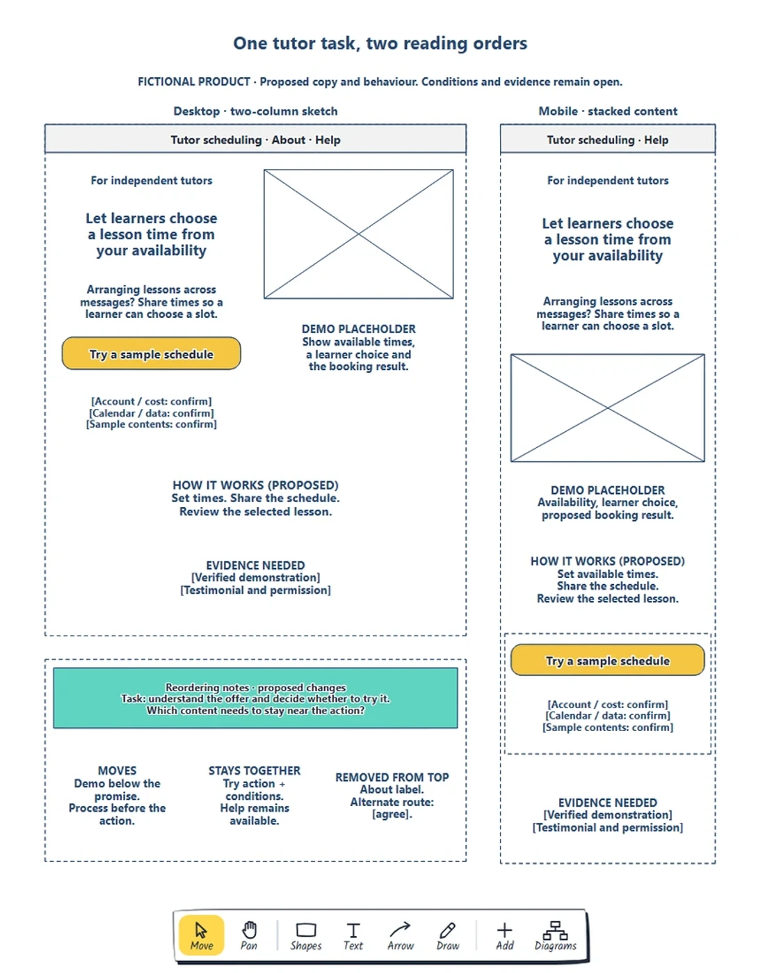
The paired layouts, captured from the EpicDraw editor. Both support the same tutor task; the notes explain the proposed change in reading order.
Double-click a label to edit it. Replace the reader and promise first, then the explanation and action. Move the shapes inside the narrow boundary to try your proposed order. Keep labels readable while you rearrange the content.
Download the worked example to compare it with the starter. The two boundaries are planning sketches on one editable page. Their drawing dimensions do not define CSS breakpoints or make a website responsive.
Keep requirements beside the action
Follow the narrow layout to "Try a sample schedule". What does the tutor need to know at that point? A condition placed in another desktop column may be far away once the content is stacked.
Our mobile sketch keeps the action with placeholders for account and cost requirements, calendar and data questions, and sample contents. The team still needs to answer them. Keeping them together makes the missing decisions visible before the page is built.
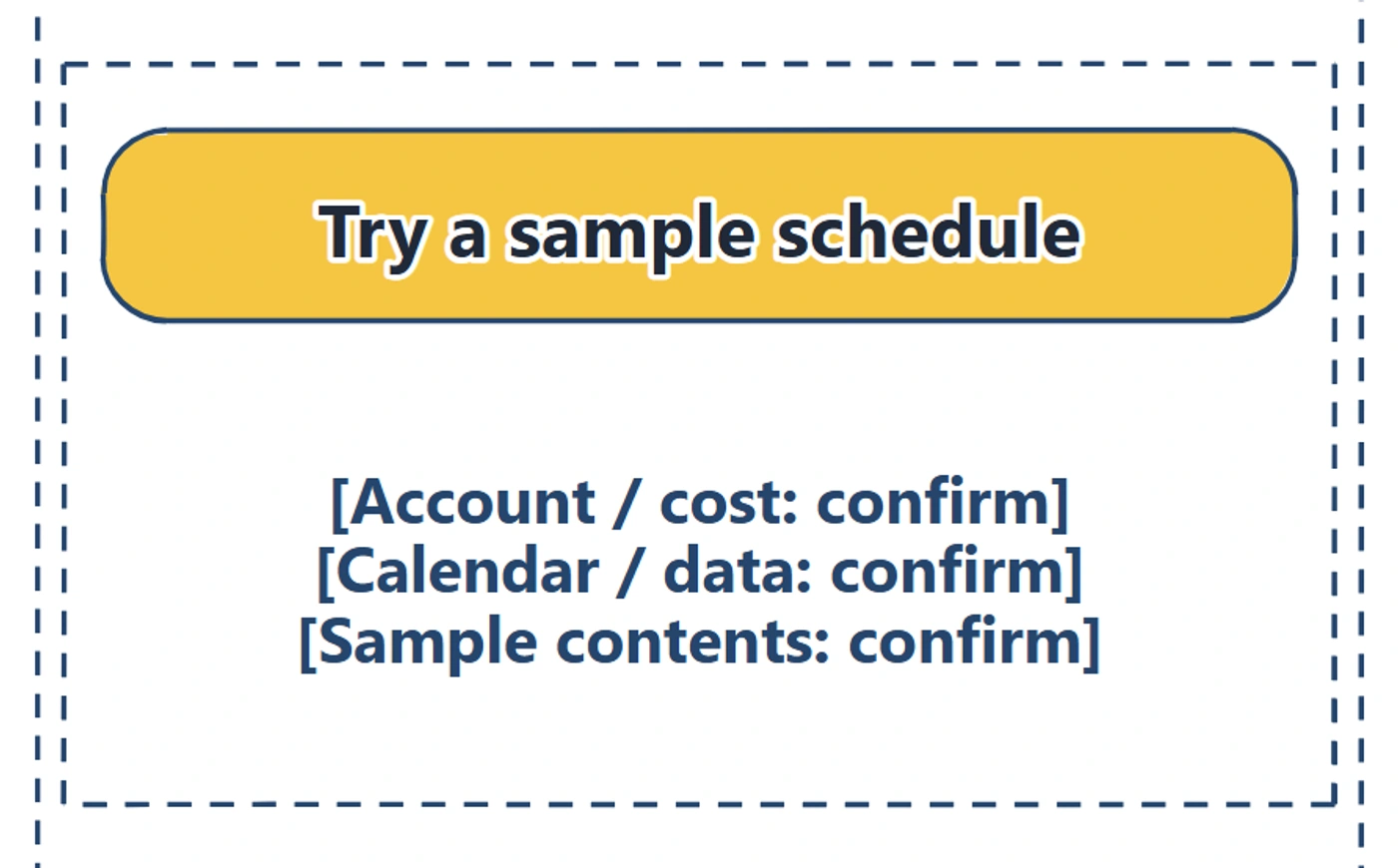
The action and its requirements remain one group. Moving that group preserves the relationship between the choice and the information needed to judge it.
If you change the action's position, move its supporting information with it. If you propose repeating the action farther down the page, check which conditions that second placement needs. Avoid covering content with a fixed button before you have reviewed the space it occupies.
Review content and controls
Ask a teammate to read the narrow sketch as the tutor. Let them explain the offer, what the demonstration should show and what they expect after the action. Then compare their explanation with the desktop version. Record any question that appears only after the order changes.
If a needed answer disappeared, restore it or make its destination clear. If the answer exists but is hard to find, adjust the order or wording. If nobody knows the sample's requirements, give the question to its owner; changing the layout cannot answer it.
Look at the controls too. Can someone distinguish the main action from Help? Is there room between separate controls? W3C's target-size guidance explains minimum target size and spacing, including exceptions. Check those requirements on the implemented interface; a large rectangle in a drawing does not establish the size of its working tap target.
Review a narrow version and any longer labels your product uses. In the working page, test zoom, text wrapping, keyboard access and actual control behaviour. A wireframe review can identify questions to resolve, while those implementation checks establish how the page behaves.
Follow the action to its destination
The review may reach a question beyond this page: does the action open the sample, ask for an account or lead to instructions? Draw the proposed destination beside the narrow sketch and connect it to the action.
Nielsen Norman Group's explanation of wireflows describes combining screen layouts with connections that show interactions. Use that approach when the reader's next step needs another state to explain it. Keep the destination and unresolved behaviour consistent across both layouts.
Review checklist
Use this mobile wireframe checklist before sharing:
- Keep the same visitor task across both versions.
- Give each content block a purpose and a place in the reading order.
- Preserve necessary information and explain any moved destination.
- Keep requirements beside the action they affect.
- Check longer labels and space between separate controls.
- Record questions raised by the changed order.
- Follow the action to its next state.
- Plan checks of reflow, zoom, keyboard access and targets on the working page.
Copy this worksheet to carry the review into the next draft:
Visitor's task:
Information needed before acting:
Proposed narrow reading order:
What moves, and why:
What stays beside the action:
What leaves its current position, and where it goes:
Question raised in the review:
Next change, owner and review date:
Implementation checks still needed:
Keep the editable page for later revisions. EpicDraw's backup instructions explain how to save a native copy with its shapes and labels.
Optional: create the example with MCP
If your AI assistant supports remote MCP with OAuth sign-in, you can ask it to create paired wireframes in EpicDraw. MCP connects the assistant to EpicDraw's diagram tools.
Use a free EpicDraw account, enable cloud sync and allow the assistant to create and edit diagrams when approving the connection. Only synced pages are available to the remote server. Add https://epicdraw.app/mcp using the MCP connection guide.
Paste this prompt into the connected assistant:
Using the connected EpicDraw MCP server, create a new editable page named "Paired desktop and mobile wireframes". Leave existing pages unchanged.

Create side-by-side desktop and mobile wireframes for a fictional tutor scheduling landing page. Include the reader problem, a short explanation, a demo placeholder and a try-it action. Reorder the narrow version around that action; annotate what moves, stays together or is removed.

Use editable shapes, text and connectors. Label the example as fictional and mark unknowns as open questions. This is a visual planning draft. Check for overlapping objects and overflowing labels, then return a PNG preview and the private editor link. Leave the result as a draft for me to review.
Inspect the preview and open the private editor link while signed in. Check the content order and supporting conditions in both versions before adapting the draft. Assistant layouts vary; the prompt creates planning diagrams, and your website still needs to implement and test the responsive behaviour.
Takeaways
- Use the same visitor task to judge both layouts.
- Choose the narrow reading order before resizing individual boxes.
- Preserve the information and conditions needed to act.
- Record what changes position, then review the destination and test the working page.
Keep your next draft close
Create a free account to save your pages in the cloud and use them across devices.
Create a free accountYou can keep drawing without an account.