
A dashboard wireframe helps you agree what someone needs to see before making a decision. For a SaaS designer, that means turning a collection of available data into a screen with a clear purpose: recognise the situation, find the relevant item and decide what to do next.
Start by writing one sentence: “This person opens the dashboard to decide ____.” Use it to choose the information and actions for the first screen. This guide walks through that choice, builds a support dashboard example and shows how to review it with a teammate. The editable starter gives you the same structure to adapt.
What a dashboard wireframe needs to show
A dashboard wireframe is a rough layout of summaries, records and actions. It shows what appears together and how someone moves from an overview to the work behind it. You can leave out visual styling while the team agrees what the information means.
Figma describes wireframes as basic layouts with a content hierarchy. For a dashboard, that hierarchy needs a reason. A large number might draw attention, but the person still needs to know what it counts, whether it matters now and where to go for the underlying items.
Write down the question each block answers before sketching it. “How many requests have no owner?” gives an unassigned count a purpose. “We have this data” leaves you without a useful test for whether it belongs on the first screen.
You may need different first screens for different roles. A support lead assigning work and a manager reviewing longer-term demand have different questions. Choose the role you are designing for before trying to fit both tasks into one layout.
For the basic method of turning a task into a rough screen, follow how to create a low-fidelity wireframe before choosing the dashboard summaries and actions.
Give the first screen a decision
Our worked example follows a support lead starting a morning review. They need to choose the next request to assign. Your job as the designer is to make the information needed for that choice visible, then expose the decisions the team has yet to agree.
The support queue, requests and counts are fictional. Every count in the drawing is marked illustrative; it has no connection to live support data.
Write this task beside the sketch: “Choose the next request to assign.” Then add the review question: “Which request would you open first, and what would you need before assigning it?”
That question gives the dashboard a manageable scope. The lead needs an overview of new, urgent and unassigned work, followed by enough detail to choose a request. A chart of last quarter's ticket volume can wait for a separate trend-review task.
Choose summaries that lead to work
With the decision in place, make a small inventory of information. Connect each summary to a question and a proposed destination:
| Summary | Decision it supports | Proposed next step |
|---|---|---|
| New requests | What arrived during the example morning? | Review the new-request list |
| Urgent work | Which open requests need an urgency review? | Open the urgent items |
| Unassigned items | Which open requests still need an owner? | Review and assign a request |
The example uses 8 new requests, 3 urgent items and 5 unassigned items. These are separate illustrative groups that may overlap. An urgent request can also be unassigned, so adding the three cards would not give a total queue size.
Put those definitions next to the sketch. Before using real counts, agree the scope, time period and rules behind each one. Does “new” mean received today or never opened? Does “urgent” come from a person, a rule or a customer-selected flag? Which status counts as open? Those answers affect both the count and the work behind it.
Keep the destination visible too. If a summary opens a filtered list, note that behaviour. If the team has not agreed it, mark it as an open question. This lets a reviewer discuss the intended route instead of assuming a number is clickable.
Build the overview and next-action list
Open the dashboard wireframe template near the top of this page. It adds a new editable page and preserves your existing drawings. To inspect the filled version, download the worked example and use the app's Import option.
The example puts the three summaries above a next-action list. That order lets the lead recognise the overall situation, then look at specific requests without changing screens. A separate decision inventory explains why each area is there.
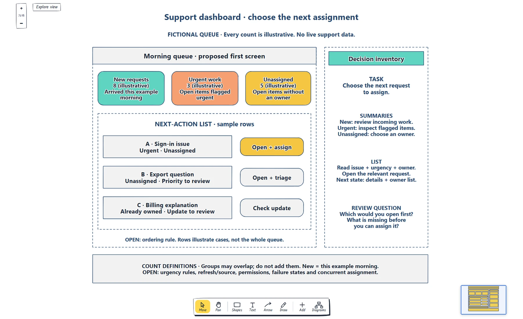
The summaries introduce the work; the list makes it possible to choose an item. Notes beside the screen connect each area to the decision it supports.
Double-click a label to edit it. Replace the task first, then rename the summary cards to match the information your role needs. An invoice dashboard might focus on payments awaiting review; a project dashboard might focus on work without an owner. The labels change because the decision changes.
For the support example, each list row includes the issue, urgency and ownership. Those details explain why the lead might open that request. The proposed action sits beside them, so the next step is easy to discuss.
The list has three sample rows:
- A sign-in issue is urgent and unassigned. Its proposed route is “Open + assign”.
- An export question is unassigned, with priority still to review. Its proposed route is “Open + triage”.
- A billing explanation already has an owner. Its proposed route is “Check update”.
These rows show possible cases rather than a complete queue. Their order is a proposal for review, not an agreed prioritisation rule. Leave the ordering rule visible as an open question until the team confirms how the lead should choose between competing requests.
Make the next step specific enough to review
A summary card alone cannot tell the lead whether a request is ready to assign. The list adds context, but the next state still needs a definition.
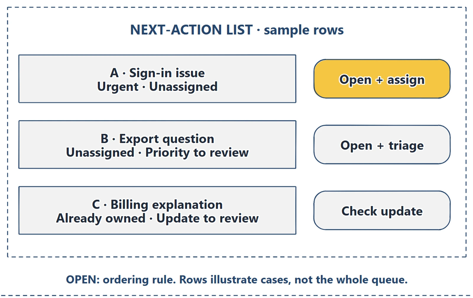
The row keeps the issue, urgency and ownership beside the proposed action. The ordering note makes an unresolved product decision visible.
Ask what “Open + assign” should lead to. The lead may need the request details, an eligible owner list and a way to confirm the assignment. Add those requirements to the inventory before drawing the next screen. Also ask what happens if another teammate assigns the same request first.
When the answer needs a sequence, sketch the request detail and assignment result, then connect them to the list. Nielsen Norman Group's wireflow explanation covers combining layouts with connections that represent interactions. You can use that approach to review the proposed route through the dashboard.
Data states need the same attention. Mark where a real product would explain stale data, a failed refresh or an empty queue. “No unassigned requests” has a different meaning from “Unable to load unassigned requests”. The example leaves refresh behaviour, permissions and failure handling open so the team can agree them before implementation.
Review a busy morning scenario
Give a teammate the task from the margin and let them read the screen before you explain it. Ask which sample request they would open first and what information they used to choose it.
Record where their reasoning stops. If they cannot tell whether urgent work includes unassigned requests, the definitions need work. If they recognise the sign-in issue but cannot see its proposed action, try a clearer label or position. If they ask who is allowed to assign it, record a permissions decision; moving the button will not answer that question.
Then change one condition. Suppose the urgent request has just gained an owner. Ask what the lead should see and whether the next action still makes sense. This exposes assumptions about updates and ownership without pretending the drawing implements them.
Use the answers to decide the next revision. Keep a note of the change, who needs to answer an open question and when you will review it again.
Review checklist
Use this dashboard wireframe checklist before sharing your draft:
- The role and first decision are written beside the screen.
- Each summary has a definition, scope and proposed destination.
- Sample counts are labelled, and overlapping groups are explained.
- List rows contain enough context to discuss the next action.
- Ordering, refresh behaviour, permissions and failure states are agreed or visibly open.
- A teammate can describe what they would open first and why.
Copy this worksheet for your own dashboard:
Role and first decision:
Summary / meaning / scope / destination:
Information needed before acting on an item:
Proposed action and next state:
Ordering rule and overlapping groups:
Refresh, empty, stale and failure states:
Permissions or concurrent-change questions:
Question raised / next change / owner / review date:
Optional: create the example with an AI assistant
MCP connects an assistant to EpicDraw's diagram tools. If your assistant supports remote MCP with OAuth sign-in, you can use it to create an editable starting point for this walkthrough.
You need a free EpicDraw account, cloud sync and permission for the assistant to create and edit diagrams. Open More, choose Connect AI assistant and add https://epicdraw.app/mcp in your assistant. Approve the create/edit permission when connecting. The MCP connection guide explains the steps.
Paste this prompt into the connected assistant:
Using the connected EpicDraw MCP server, create a new editable page named "Support dashboard and decision inventory". Leave existing pages unchanged.

Sketch a dashboard for a fictional support lead. Include new requests, urgent work, unassigned items and a next-action list. Label every sample count as illustrative. Add notes linking each area to the decision it supports; do not imply that the board connects to live support data.

Use editable shapes, text and connectors. Label the example as fictional and mark unknowns as open questions. This is a visual planning draft. Check for overlapping objects and overflowing labels, then return a PNG preview and the private editor link. Leave the result as a draft for me to review.
Inspect the returned preview, then open the private editor link while signed in. Check the fictional labels, count definitions, sample rows and open questions before adapting it. The layout may differ from the screenshots. This creates a planning diagram; it does not connect support data or build a working dashboard.
Takeaways
- Choose a role and a decision before choosing dashboard content.
- Give each summary a meaning and a route to the work behind it.
- Put item context beside the action it supports.
- Keep data definitions and unresolved behaviour visible during review.
- Use the review to distinguish unclear layout from product decisions that still need an answer.
Keep your next draft close
Create a free account to save your pages in the cloud and use them across devices.
Create a free accountYou can keep drawing without an account.