Why hand-drawn wireframes get better feedback
Blog · 3 October 2026 · 5 minute read
- How a mockup looks tells people what kind of feedback you want.
- A polished mockup looks finished, so people comment on details: colours, fonts, spacing.
- A rough, hand-drawn one looks open to change, so people comment on structure: what's on the page, in what order, and why.
- Sketch first and agree the structure. Polish later, once the big decisions are settled.
The problem with pixel-perfect too early
You share a mockup to answer a big question. Should the price sit above the fold? Do we need the reviews tab at all? Is this page trying to do too much?
Then the comments come back. "Can the button be a bit darker?" "I'm not sure about that font." "The logo looks small."
None of these are bad points, but they answer questions you didn't ask. A polished mockup looks like a design that's nearly done, and people respond to what they see. If it looks nearly done, the only things left to discuss seem to be the finishing touches.
There's a cost on your side too. Once you've spent hours aligning every pixel, it's harder to hear "this whole section shouldn't exist". The more finished something looks, the more it feels like it's being defended rather than discussed.
Rough says "this is a draft"
Wobbly lines, handwritten labels and grey boxes with a cross through them all send the same message: nothing here is decided yet. That gives people permission to push back on the parts that matter.
Designers have argued this for a long time. Bill Buxton's book Sketching User Experiences makes the case that a sketch should look as provisional as the thinking behind it, so people treat it as something to explore, not something to approve. In our experience it holds up in practice. When the styling is obviously placeholder, people stop commenting on it.
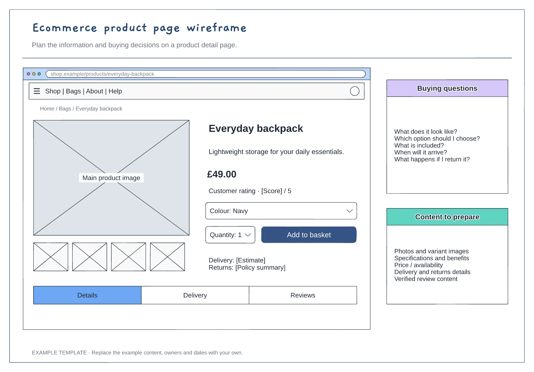
What changes in the feedback
With a rough mockup, the conversation tends to move to the questions that are expensive to get wrong later:
- What's missing? "Where do people find the returns policy?"
- What's in the wrong order? "Reviews should come before the specification."
- What can go? "Do we really need four thumbnail images here?"
- Does the flow make sense? "What happens after they click Add to basket?"
These are the decisions that shape a page. They're cheap to change in a sketch and costly to change once a page is designed, built and tested.
Who this helps most
- Marketers and CRO teams planning A/B test variants, who need sign-off on the idea before anyone builds it.
- SEO and content teams agreeing what a page needs to say and in what order, before writing the copy.
- Founders and product managers explaining an idea to a developer or designer without pretending to be one.
- Agencies showing a client a direction early, so the first real design round isn't spent undoing a misunderstanding.
When to switch to polished
Rough isn't always better. Once the structure is agreed, the details really do matter: real copy, brand colours, spacing and accessibility. At that point a high-fidelity design in a tool like Figma, or a working prototype, is the right next step.
A good rule: sketch until people stop asking structural questions. When the only comments left are about colours and fonts, the sketch has done its job.
Tips for a useful rough mockup
- Use real-ish content. "Everyday backpack, £49.00" makes a page easier to judge than "Lorem ipsum".
- Show one idea per mockup. If you're comparing two layouts, make two pages and put them side by side.
- Write down the question. Add a note saying what you want feedback on, such as "Is the price easy to find?"
- Keep it quick. If a sketch takes more than half an hour, it's probably too polished.
Try it
epicdraw draws everything in a hand-drawn style by default, with wireframe pieces like browser windows, buttons, inputs, tabs and image placeholders ready to drop in. It's free to use in your browser, with no account needed. If you connect an AI assistant, you can describe a page, or hand it a screenshot, and get an editable rough mockup back.